Google AMP - Selector 选择器
Amp-selector 是一个 amp 组件,它显示选项菜单,用户可以在选项之间进行选择。显示的选项可以是文本、图像或任何其他 amp 组件。在本章中,我们将详细讨论这一点。
要使用 amp-selector,我们需要包含以下 javascript 文件 −
<script async custom-element = "amp-selector"
    src = "https://cdn.ampproject.org/v0/amp-selector-0.1.js">
</script>
amp-selector 的格式
以下代码显示了 amp-selector 格式的示例 −
<amp-selector layout = "container">
   <amp-img src = "images/christmas1.jpg"
      width = "60"
      height = "40"
      option = "1">
   <amp-img src = "images/christmas2.jpg"
      width = "60"
      height = "40"
      option = "2">
   </amp-img>
   <amp-img src = "images/christmas3.jpg"
      width = "60"
      height = "40"
      option = "3">
   </amp-img>
   <amp-img src = "images/christmas4.jpg"
      width = "60"
      height = "40"
      option = "4">
   </amp-img>
</amp-selector>
您可以在 amp-selector 中使用标准 html 标签或 amp 组件。内容像菜单一样显示在屏幕上,用户可以在它们之间进行选择。显示的菜单可以是单选或多选。
让我们借助下面给出的单选和多选示例来理解这一点。
Amp Selector 单选
以下代码是 amp-selector 单选的示例 −
<!doctype html>
<html amp lang = "en">
   <head>
      <meta charset = "utf-8">
      <script async src = "https://cdn.ampproject.org/v0.js"></script>
      <title>Google AMP - Amp Selector</title>
      <link rel = "canonical" href = "http://example.ampproject.org/article-metadata.html">
      <meta name="viewport" content="width=device-width,minimum-scale = 1,initial-scale = 1">

      <style amp-boilerplate>
         body{-
            webkit-animation:-amp-start 8s steps(1,end) 0s 1 normal both;-moz-animation:
            -amp-start 8s steps(1,end) 0s 1 normal both;-ms-animation:
            -amp-start 8s steps(1,end) 0s 1 normal both;animation:
            -amp-start 8s steps(1,end) 0s 1 normal both
         }
         @-webkit-keyframes
         -amp-start{from{visibility:hidden}to{visibility:visible}}@-moz-keyframes
         -amp-start{from{visibility:hidden}to{visibility:visible}}@-ms-keyframes
         -amp-start{from{visibility:hidden}to{visibility:visible}}@-o-keyframes
         -amp-start{from{visibility:hidden}to{visibility:visible}}@keyframes
         -amp-start{from{visibility:hidden}to{visibility:visible}}
      </style>
      <noscript>
         <style amp-boilerplate>
            body{
            -webkit-animation:none;-moz-animation:none;
            -ms-animation:none;animation:none}
         </style>
      </noscript>

      <script async custom-element="amp-selector"
         src = "https://cdn.ampproject.org/v0/amp-selector-0.1.js">
      </script>
      <style amp-custom>
         amp-selector:not([disabled])
         amp-img[option][selected]:not([disabled]) {
            outline-color: #b6A848;
            outline-width: 2px;
         }
      </style>
   </head>
   <body>
      <h3>Google AMP - Amp Selector</h3>
      <amp-selector layout = "container">
         <amp-img src = "images/christmas1.jpg"
            width = "60"
            height = "40"
            option="1">
         </amp-img>
         <amp-img src="images/christmas2.jpg"
            widt h = 60"
            height = "40"
            option = "2">
         </amp-img>
         <amp-img src = "images/christmas3.jpg"
            width = "60"
            height = "40"
            option = "3">
         </amp-img>
         <amp-img src = "images/christmas4.jpg"
            width = "60"
            height = "40"
            option = "4">
         </amp-img>
      </amp-selector>
   </body>
</html>
输出
上述代码的输出如下所示 −
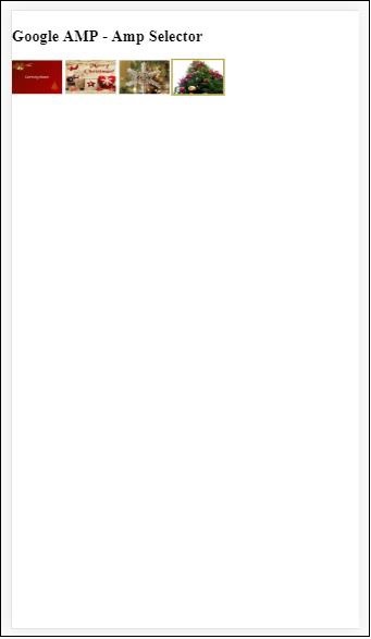
请注意,在上面的示例中,我们使用了 amp-selector 并使用其中的图像来显示选项。它是一个单选选择器,因此您可以选择输出中所示的任意一个图像。
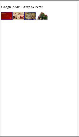
Amp Selector 多选
在此示例中,让我们使用多个属性显示带有图像的 amp-selector,我们可以从选择器中选择多个选项。
示例
<!doctype html>
<html amp lang = "en">
   <head>
      <meta charset = "utf-8 ">
      <script async src = "https://cdn.ampproject.org/v0.js"></script>
      <title>Google AMP - Amp Selector</title>
      <link rel = "canonical" href = "http://example.ampproject.org/article-metadata.html">
      <meta name = "viewport" content = "width = device-width,minimum-scale = 1,initial-scale =1">

      <style amp-boilerplate>
         body{-webkit-animation:
            -amp-start 8s steps(1,end) 0s 1 normal both;-moz-animation:
            -amp-start 8s steps(1,end) 0s 1 normal both;-ms-animation:
            -amp-start 8s steps(1,end) 0s 1 normal both;animation:
            -amp-start 8s steps(1,end) 0s 1 normal both}
         @-webkit-keyframes
         -amp-start{from{visibility:hidden}to{visibility:visible}}@-moz-keyframes
         -amp-start{from{visibility:hidden}to{visibility:visible}}@-ms-keyframes
         -amp-start{from{visibility:hidden}to{visibility:visible}}@-o-keyframes
         -amp-start{from{visibility:hidden}to{visibility:visible}}@keyframes
         -amp-start{from{visibility:hidden}to{visibility:visible}}
      </style>

      <noscript>
         <style amp-boilerplate>
            body{
               -webkit-animation:none;-moz-animation:none;
               -ms-animation:none;animation:none
            }
         </style>
      </noscript>

      <script async custom-element = "amp-selector"
         src = "https://cdn.ampproject.org/v0/amp-selector-0.1.js">
      </script>

      <style amp-custom>
         amp-selector:not([disabled])
         amp-img[option][selected]:not([disabled]) {
            outline-color: blue;
            outline-width: 2px;
         }
      </style>
   </head>
   <body>
      <h3>Google AMP - Amp Selector</h3>
      <amp-selector layout = "container" multiple>
         <amp-img src = "images/christmas1.jpg"
            width = "60"
            height ="40"
            option = "1">
         </amp-img>
         <amp-img src="images/christmas2.jpg"
            width = "60"
            height = "40"
            option = "2">
         </amp-img>
         <amp-img src ="images/christmas3.jpg"
            width = "60"
            height = "40"
            option = "3">
         </amp-img>
         <amp-img src = "images/christmas4.jpg"
            width = "60"
            height = "40"
            option = "4">
         </amp-img>
      </amp-selector>
   </body>
</html>
输出
上述代码的输出如下所示 −
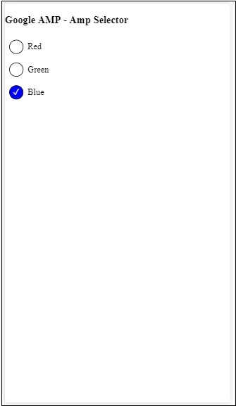
我们还可以使用 amp-selector 显示单选按钮,如下面给出的代码所示 −
示例
<!doctype html>
<html amp lang = "en">
   <head>
      <meta charset = "utf-8">
      <script async src = "https://cdn.ampproject.org/v0.js"></script>
      <title>Google AMP - Amp Selector</title>
      <link rel = "canonical" href = "http://example.ampproject.org/article-metadata.html">
      <meta name = "viewport" content ="width = device-width,minimum-scale = 1,initial-scale = 1">

      <style amp-boilerplate>
         body{
            -webkit-animation:
            -amp-start 8s steps(1,end) 0s 1 normal both;-moz-animation:
            -amp-start 8s steps(1,end) 0s 1 normal both;-ms-animation:
            -amp-start 8s steps(1,end) 0s 1 normal both;animation:
            -amp-start 8s steps(1,end) 0s 1 normal both
         }
         @-webkit-keyframes
         -amp-start{from{visibility:hidden}to{visibility:visible}}@-moz-keyframes
         -amp-start{from{visibility:hidden}to{visibility:visible}}@-ms-keyframes
         -amp-start{from{visibility:hidden}to{visibility:visible}}@-o-keyframes
         -amp-start{from{visibility:hidden}to{visibility:visible}}@keyframes
         -amp-start{from{visibility:hidden}to{visibility:visible}}
      </style>

      <noscript>
         <style amp-boilerplate>
            body{
               -webkit-animation:none;
               -moz-animation:none;
               -ms-animation:none;
               animation:none}
         </style>
      </noscript>
      <script async custom-element = "amp-selector"
         src = "https://cdn.ampproject.org/v0/amp-selector-0.1.js">
      </script>
      <style amp-custom>
         .radio-menu {
            list-style: none;
         }
         .radio-menu [option][selected] {
            outline: none;
         }
         .radio-menu [option] {
            display: flex;
            align-items: center;
         }
         .radio-menu [option]:before {
            transition: background 0.25s ease-in-out;
            content: "";
            display: inline-block;
            width: 24px;
            height: 24px;
            margin: 8px;
            border-radius: 100%;
            border: solid 1px black;
         }
         .radio-menu [option  = red][selected]:before {
            text-align: center;
            content: "✓";
            color: white;
            background: red;
         }
         .radio-menu [option  = green][selected]:before {
            text-align: center;
            content: "✓";
            color: white;
            background: green;
         }
         .radio-menu [option  = blue][selected]:before {
            text-align: center;
            content: "✓";
            color: white;
            background: blue;
         }
      </style>
   </head>
   <body>
      <h3>Google AMP - Amp Selector</h3>
      <amp-selector class = "radio-menu" layout = "container" name = "my-selector">
         <div option = "red">Red</div>
         <div option = "green">Green</div>
         <div option = "blue">Blue</div>
      </amp-selector>
   </body>
</html>
输出