Google AMP - 布局
AMP-Layout 是 Google-amp 中的重要功能之一。Amp Layout 可确保页面加载时正确呈现 amp 组件,而不会引起任何闪烁或滚动问题。 Google AMP 确保在任何其他远程资源(如图像的 http 请求、数据调用)之前在页面上完成布局渲染。
布局属性列表如下。
width 和 height
layout
sizes
heights
media
placeholder
fallback
noloading
我们将在本章中详细考虑 layout 属性。其余属性将在 − 章中详细讨论。本教程的 Google AMP – 属性。
布局属性
我们可以在 amp-component 上使用布局属性,该属性将决定组件在页面内的呈现方式。amp 支持的布局列表如下 −
Not Present
Container
fill
fixed
fixed-height
flex-item
intrinsic
nodisplay
Responsive
对于每个布局,我们将看到一个工作示例,该示例将展示布局属性如何以不同的方式呈现 amp-component。我们将在示例中使用 amp-img 组件。
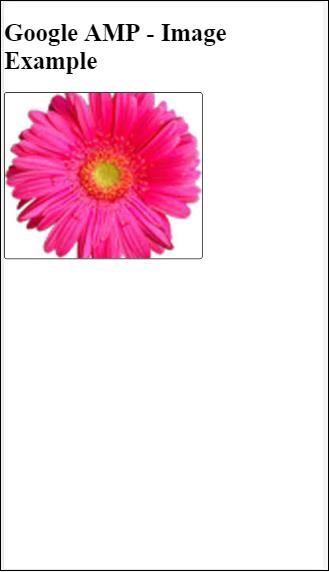
不存在的示例
<!doctype html>
<html amp lang = "en">
   <head>
      <meta charset = "utf-8">
      <script async src="https://cdn.ampproject.org/v0.js"></script>
      <title>Google AMP - Image</title>
      <link rel = "canonical" href =
         "http://example.ampproject.org/article-metadata.html">
      <meta name = "viewport" content = "width = device-width,
         minimum-scale = 1,initial-scale = 1">
      <style amp-boilerplate>
         body{
            -webkit-animation:
            -amp-start 8s steps(1,end) 0s 1 normal both;-moz-animation:
            -amp-start 8s steps(1,end) 0s 1 normal both;-ms-animation:
            -amp-start 8s steps(1,end) 0s 1 normal both;animation:
            -amp-start 8s steps(1,end) 0s 1 normal both
         }
         @-webkit-keyframes
         -amp-start{from{visibility:hidden}to{visibility:visible}}@-moz-keyframes
         -amp-start{from{visibility:hidden}to{visibility:visible}}@-ms-keyframes
         -amp-start{from{visibility:hidden}to{visibility:visible}}@-o-keyframes
         -amp-start{from{visibility:hidden}to{visibility:visible}}@keyframes
         -amp-start{from{visibility:hidden}to{visibility:visible}}
      </style>
      <noscript>
         <style amp-boilerplate>
            body{
               -webkit-animation:none;
               -moz-animation:none;
               -ms-animation:none;
               animation:none
            }
         </style>
      </noscript>
      <style amp-custom>
         amp-img {
            border: 1px solid black;
            border-radius: 4px;
            padding: 5px;
         }
      </style>
   </head>
   <body>
      <h1>Google AMP - Image Example</h1>
      <amp-img
         alt = "Beautiful
         Flower"src = "images/flower.jpg"
         width = "246"
         height = "205">
      </amp-img>
   </body>
</html>
输出
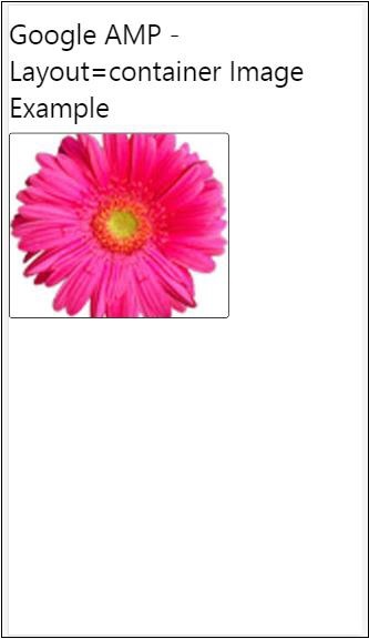
容器示例
Layout="container" 主要提供给父元素,子元素采用定义的大小。
<!doctype html>
<html amp lang = "en">
   <head>
      <meta charset = "utf-8">
      <script async src = "https://cdn.ampproject.org/v0.js"></script>
      <title>Google AMP - Image</title>
      <link rel = "canonical" href =
         "http://example.ampproject.org/article-metadata.html">
      <meta name = "viewport" content = "width = device-width,
         minimum-scale = 1,initial-scale = 1">
      <style amp-boilerplate>
         body{
            -webkit-animation:
            -amp-start 8s steps(1,end) 0s 1 normal both;-moz-animation:
            -amp-start 8s steps(1,end) 0s 1 normal both;-ms-animation:
            -amp-start 8s steps(1,end) 0s 1 normal both;animation:
            -amp-start 8s steps(1,end) 0s 1 normal both
         }@-webkit-keyframes
         -amp-start{from{visibility:hidden}to{visibility:visible}}@-moz-keyframes
         -amp-start{from{visibility:hidden}to{visibility:visible}}@-ms-keyframes
         -amp-start{from{visibility:hidden}to{visibility:visible}}@-o-keyframes
         -amp-start{from{visibility:hidden}to{visibility:visible}}@keyframes
         -amp-start{from{visibility:hidden}to{visibility:visible}}
      </style>
      <noscript>
         <style amp-boilerplate>
            body{
               -webkit-animation:none;
               -moz-animation:none;
               -ms-animation:none;
               animation:none
            }
         </style>
      </noscript>
      <style amp-custom>
         amp-img {
            border: 1px solid black;
            border-radius: 4px;
            padding: 5px;
         }
         h1{
            font-family: "Segoe UI",Arial,sans-serif;
            font-weight: 400;margin: 10px 0;
         }
      </style>
   </head>
   <body>
      <h1>Google AMP - Layout = container Image Example</h1>
      <amp-accordion layout = "container">
         <amp-img alt = "Beautiful Flower"
            src = "images/flower.jpg"
            width = "246"
            height = "205">
         </amp-img>
      </amp-accordion>
   </body>
</html>
输出
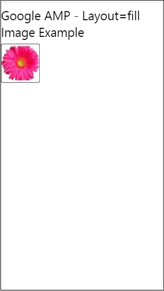
填充示例
Layout= "fill" 采用父元素的宽度和高度。
<!doctype html>
<html amp lang = "en">
   <head>
      <meta charset = "utf-8">
      <script async src = "https://cdn.ampproject.org/v0.js"></script>
      <title>
      Google AMP - Image
      <title>
      <link rel = "canonical" href =
         "http://example.ampproject.org/article-metadata.html">
      <meta name = "viewport" content = "width = device-width,
         minimum-scale = 1,initial-scale = 1">
      <style amp-boilerplate>
         body{
            -webkit-animation:
            -amp-start 8s steps(1,end) 0s 1 normal both;-moz-animation:
            -amp-start 8s steps(1,end) 0s 1 normal both;-ms-animation:
            -amp-start 8s steps(1,end) 0s 1 normal both;animation:
            -amp-start 8s steps(1,end) 0s 1 normal both
         }
         @-webkit-keyframes
         -amp-start{from{visibility:hidden}to{visibility:visible}}@-moz-keyframes
         -amp-start{from{visibility:hidden}to{visibility:visible}}@-ms-keyframes
         -amp-start{from{visibility:hidden}to{visibility:visible}}@-o-keyframes
         -amp-start{from{visibility:hidden}to{visibility:visible}}@keyframes
         -amp-start{from{visibility:hidden}to{visibility:visible}}
      </style>
      <noscript>
         <style amp-boilerplate>
            body{
               -webkit-animation:none;
               -moz-animation:none;
               -ms-animation:none;
               animation:none
            }
         </style>
      </noscript>
      <style amp-custom>
         amp-img {
            border: 1px solid black;
            border-radius: 4px;
            padding: 5px;
         }
         h1{font-family: "Segoe UI",Arial,sans-serif;
         font-weight: 400;margin: 10px 0;}
      </style>
   </head>
   <body>
      <h1>Google AMP - Layout = fill Image Example</h1>
      <div style = "position:relative;width:100px;height:100px;">
         <amp-img alt = "Beautiful Flower"
            src = "images/flower.jpg"
            width = "246"
            height = "205"
            layout = "fill">
         </amp-img>
      </div>
   </body>
</html>
输出
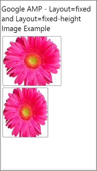
固定和固定高度示例
在了解固定和固定高度的用法之前,请注意以下两点 −
layout="fixed" 需要有宽度和高度,amp-component 将显示在其中。
layout="fixed-height" 需要为组件指定高度。它将确保高度不会改变。使用固定高度时不得指定宽度,否则可以是自动的。
<!doctype html>
<html amp lang = "en">
   <head>
      <meta charset = "utf-8">
      <script async src = "https://cdn.ampproject.org/v0.js"></script>
      <title>Google AMP - Image</title>
      <link rel = "canonical" href =
         "http://example.ampproject.org/article-metadata.html">
      <meta name = "viewport" content = "width = device-width,
         minimum-scale = 1,initial-scale = 1">
      <style amp-boilerplate>
         body{
            -webkit-animation:
            -amp-start 8s steps(1,end) 0s 1 normal both;-moz-animation:
            -amp-start 8s steps(1,end) 0s 1 normal both;-ms-animation:
            -amp-start 8s steps(1,end) 0s 1 normal both;animation:
            -amp-start 8s steps(1,end) 0s 1 normal both
         }
         @-webkit-keyframes
         -amp-start{from{visibility:hidden}to{visibility:visible}}@-moz-keyframes
         -amp-start{from{visibility:hidden}to{visibility:visible}}@-ms-keyframes
         -amp-start{from{visibility:hidden}to{visibility:visible}}@-o-keyframes
         -amp-start{from{visibility:hidden}to{visibility:visible}}@keyframes
         -amp-start{from{visibility:hidden}to{visibility:visible}}
      </style>
      <noscript>
         <style amp-boilerplate>
            body{
               -webkit-animation:none;
               -moz-animation:none;
               -ms-animation:none;
               animation:none
            }
         </style>
      </noscript>
      <style amp-custom>
         amp-img {
            border: 1px solid black;
            border-radius: 4px;
            padding: 5px;
         }
         div{
            display: inline-block;
            width: 200px;
            height:200px;
            margin: 5px;
         }
         h1{font-family: "Segoe UI",Arial,sans-serif;
         font-weight: 400;margin: 10px 0;}
      </style>
   </head>
   <body>
      <h1>Google AMP - Layout = fixed and
         Layout = fixed-height Image Example
      </h1>
      <div>
         <amp-img alt = "Beautiful Flower"
            src = "images/flower.jpg"
            width = "246"
            height = "205"
            layout = "fixed">
         </amp-img>
      </div>
      <div>
         <amp-img alt = "Beautiful Flower"
            src = "images/flower.jpg"
            height = "205"
            layout = "fixed-height">
         </amp-img>
      </div>
   </body>
</html>
输出
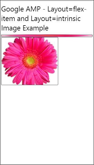
弹性项目和内在
<!doctype html>
<html amp lang = "en">
   <head>
      <meta charset = "utf-8">
      <script async src ="https://cdn.ampproject.org/v0.js"></script>
      <title>Google AMP - Image</title>
      <link rel = "canonical" href ="
         http://example.ampproject.org/article-metadata.html">
      <meta name = "viewport" content = "width = device-width,
         minimum-scale = 1,initial-scale = 1">
      <style amp-boilerplate>
         body{
            -webkit-animation:
            -amp-start 8s steps(1,end) 0s 1 normal both;-moz-animation:
            -amp-start 8s steps(1,end) 0s 1 normal both;-ms-animation:
            -amp-start 8s steps(1,end) 0s 1 normal both;animation:
            -amp-start 8s steps(1,end) 0s 1 normal both
         }
         @-webkit-keyframes
         -amp-start{from{visibility:hidden}to{visibility:visible}}@-moz-keyframes
         -amp-start{from{visibility:hidden}to{visibility:visible}}@-ms-keyframes
         -amp-start{from{visibility:hidden}to{visibility:visible}}@-o-keyframes
         -amp-start{from{visibility:hidden}to{visibility:visible}}@keyframes
         -amp-start{from{visibility:hidden}to{visibility:visible
      <style>
         <noscript>
      <style amp-boilerplate>
      body{
         -webkit-animation:none;
         -moz-animation:none;
         -ms-animation:none;
         animation:none
      }
      </style>
      </noscript>
      <style amp-custom>
         amp-img {
            border: 1px solid black;
            border-radius: 4px;
            padding: 5px;
         }
         displayitem {
            display: inline-block;
            width: 200px;
            height:200px;
            margin: 5px;
         }
         h1{font-family: "Segoe UI",Arial,sans-serif;
         font-weight: 400;margin: 10px 0;}
      </style>
   </head>
   <body>
      <h1>Google AMP - Layout = flex-item and
         Layout = intrinsic Image Example
      </h1>
      <div class = "displayitem">
         <amp-img alt = "Beautiful Flower"
            src = "images/flower.jpg"
            layout = "flex-item">
         </amp-img>
      </div>
      <div class = "displayitem">
         <amp-img alt = "Beautiful Flower"
            src = "images/flower.jpg"
            width = "246"
            height = "205"
            layout = "intrinsic">
         </amp-img>
      </div>
   </body>
</html>
输出
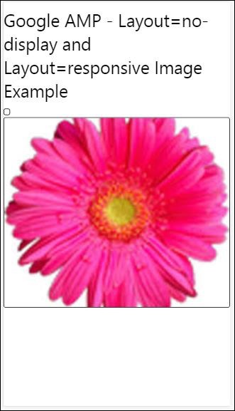
nodisplay 和 responsive
layout = nodisplay 的 Amp 组件不会占用页面上的任何空间,就像 display:none 一样。无需向此类布局添加任何 width 和 height 属性。
layout = responsive 的 Amp 组件将占用页面的可用空间或宽度,高度会调整大小以保持元素的纵横比。
<!doctype html>
<html amp lang = "en">
   <head>
      <meta charset = "utf-8">
      <script async src = "https://cdn.ampproject.org/v0.js">
      </script>
      <title>Google AMP - Image</title>
      <link rel = "canonical" href =
      "http://example.ampproject.org/article-metadata.html">
      <meta name = "viewport" content="width=device-width,
      minimum-scale = 1,initial-scale = 1">

      <style amp-boilerplate>
         body{
            -webkit-animation:
            -amp-start 8s steps(1,end) 0s 1 normal both;-moz-animation:
            -amp-start 8s steps(1,end) 0s 1 normal both;-ms-animation:
            -amp-start 8s steps(1,end) 0s 1 normal both;animation:
            -amp-start 8s steps(1,end) 0s 1 normal both}
         @-webkit-keyframes
         -amp-start{from{visibility:hidden}to{visibility:visible}}@-moz-keyframes
         -amp-start{from{visibility:hidden}to{visibility:visible}}@-ms-keyframes
         -amp-start{from{visibility:hidden}to{visibility:visible}}@-o-keyframes
         -amp-start{from{visibility:hidden}to{visibility:visible}}@keyframes
         -amp-start{from{visibility:hidden}to{visibility:visible}}
      </style>

      <noscript>
         <style amp-boilerplate>
            body{
               -webkit-animation:none;
               -moz-animation:none;
               -ms-animation:none;
               animation:none}
         </style>
      </noscript>
      <style amp-custom>
         amp-img {
            border: 1px solid black;
            border-radius: 4px;
            padding: 5px;
         }
         displayitem {
            display: inline-block;
            width: 200px;
            height:200px;
            margin: 5px;
         }
         h1{font-family: "Segoe UI",Arial,sans-serif;
         font-weight: 400;margin: 10px 0;}
      </style>
   </head>
   <body>
      <h1>Google AMP - Layout=no-display and
      Layout = responsive Image Example</h1>
      <div class = "displayitem">
         <amp-img alt = "Beautiful Flower"
            src = "images/flower.jpg"
            layout = "no-display">
         </amp-img>
      </div>
      <div class = "displayitem">
         <amp-img alt = "Beautiful Flower"
            src = "images/flower.jpg"
            width = "246"
            height = "205"
            layout = "responsive">
         </amp-img>
      </div>
   </body>
</html>
输出
Google AMP 支持的布局列表如下
手风琴
轮播
灯箱
滑块
侧边栏
Amp- 手风琴
Amp-accordion 是一个 amp 组件,用于以展开-折叠格式显示内容。用户可以轻松地在移动设备上查看它,他们可以从手风琴中选择他们喜欢的部分。
要使用 amp-accordion,您需要添加以下脚本 −
<script async custom-element = "amp-accordion"
   src = "https://cdn.ampproject.org/v0/amp-accordion-0.1.js">
</script>
Amp-accordion 标签
<amp-accordion>
   <section class = "seca">
      <h3>Content 1</h3>
      <div>
         <p>Content 1 is opened for amp-accordion</p>
         <p>Content 1 is opened for amp-accordion</p>
         <p>Content 1 is opened for amp-accordion</p>
         <p>Content 1 is opened for amp-accordion</p>
         <p>Content 1 is opened for amp-accordion</p>
         <p>Content 1 is opened for amp-accordion</p>
      </div>
   </section>
   …
</amp-accordion>
让我们看一个 amp-accordion 的工作示例。
<!doctype html>
<html amp lang = "en">
   <head>
      <meta charset = "utf-8">
      <script async src = "https://cdn.ampproject.org/v0.js">
      </script>
      <title>Google AMP - Amp Accordion </title>
      <link rel = "canonical" href=
      "http://example.ampproject.org/article-metadata.html">
      <meta name = "viewport" content = "width = device-width,
      minimum-scale = 1,initial-scale = 1">

      <style amp-boilerplate>
         body{
            -webkit-animation:
            -amp-start 8s steps(1,end) 0s 1 normal both;-moz-animation:
            -amp-start 8s steps(1,end) 0s 1 normal both;-ms-animation:
            -amp-start 8s steps(1,end) 0s 1 normal both;animation:
            -amp-start 8s steps(1,end) 0s 1 normal both
         }
         @-webkit-keyframes
         -amp-start{from{visibility:hidden}to{visibility:visible}}@-moz-keyframes
         -amp-start{from{visibility:hidden}to{visibility:visible}}@-ms-keyframes
         -amp-start{from{visibility:hidden}to{visibility:visible}}@-o-keyframes
         -amp-start{from{visibility:hidden}to{visibility:visible}}@keyframes
         -amp-start{from{visibility:hidden}to{visibility:visible}}
      </style>

      <noscript>
         <style amp-boilerplate>
            body{
               -webkit-animation:none;
               -moz-animation:none;
               -ms-animation:none;
               animation:none}
         </style>
      </noscript>
      <script async custom-element = "amp-accordion" src =
         "https://cdn.ampproject.org/v0/amp-accordion-0.1.js">
      </script>
      <style>
         input[type = text]{
            width: 50%;
            padding: 12px;
            border: 1px solid #ccc;
            border-radius: 4px;
            resize: vertical;
         }
         label {
            padding: 12px 12px 12px 0;
            display: inline-block;
            font-family: "Segoe UI",Arial,sans-serif;
            font-weight: 400;
         }
         .col-label {
            float: left;
            width: 25%;
            margin-top: 6px;
         }
         .col-content {
            float: left;
            width: 75%;
            margin-top: 6px;
         }
         .row:after {
            content: "";
            display: table;
            clear: both;
         }
         .amp_example {
            background-color: #f1f1f1;
            padding: 0.01em 16px;
            margin: 20px 0;
            box-shadow: 0 2px 4px 0
            rgba(0,0,0,0.16),0 2px 10px 0
            rgba(0,0,0,0.12)!important;
         }
         h3{
            font-family: "Segoe UI",Arial,sans-serif;
            font-weight: 400;margin: 10px 0;
         }
         input[type=submit] {
            background-color: #ACAD5C;
            color: white;
            padding: 12px 20px;
            border: none;
            border-radius: 4px;
            cursor: pointer;
            float: right;
         }
         .lightbox {background-color: rgba(100, 100, 100, 0.5);}
         .seca {background-color:#fff;}
      </style>
   </head>
   <body>
      <div class = "amp_example">
         <h3>Google AMP - Amp Accordion</h3>
         <amp-accordion>
            <section class = "seca">
               <h3>Content 1</h3>
               <div>
                  <p>Content 1 is opened for amp-accordion</p>
                  <p>Content 1 is opened for amp-accordion</p>
                  <p>Content 1 is opened for amp-accordion</p>
                  <p>Content 1 is opened for amp-accordion</p>
                  <p>Content 1 is opened for amp-accordion</p>
                  <p>Content 1 is opened for amp-accordion</p>
               </div>
            </section>
            <section expanded class = "seca">
               <h3>Content 2</h3>
               <div>
                  <p>Content 2 is opened for amp-accordion</p>
                  <p>Content 2 is opened for amp-accordion</p>
                  <p>Content 2 is opened for amp-accordion</p>
                  <p>Content 2 is opened for amp-accordion</p>
                  <p>Content 2 is opened for amp-accordion</p>
               </div>
            </section>
            <section class="seca">
               <h3>Content 3</h3>
               <div>
                  <p>Content 3 is opened for amp-accordion</p>
                  <p>Content 3 is opened for amp-accordion</p>
                  <p>Content 3 is opened for amp-accordion</p>
                  <p>Content 3 is opened for amp-accordion</p>
                  <p>Content 3 is opened for amp-accordion</p>
               </div>
            </section>
         </amp-accordion>
      </div>
   </body>
</html>
输出
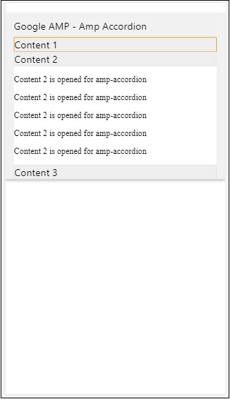
Amp-accordion 内部包含部分。每个部分可以有 2 个子部分,如果超过 2 个子部分,浏览器控制台中将显示错误。您可以在部分中添加容器,其中可以包含多个元素。
默认情况下,我们使用扩展到部分的属性将一个部分保持在扩展模式。
自动折叠手风琴
对于自动折叠,我们在 amp-accordion 上使用属性 expand-single-section,如示例所示。用户打开的部分将仅保持扩展状态,其他部分将使用 expand-single-section 属性关闭。
<!doctype html>
<html amp lang = "en">
   <head>
      <meta charset = "utf-8">
      <script async src = "https://cdn.ampproject.org/v0.js">
      </script>
      <title>Google AMP - Amp Accordion </title>
      <link rel = "canonical" href=
      "http://example.ampproject.org/article-metadata.html">
      <meta name = "viewport" content = "width = device-width,
      minimum-scale = 1,initial-scale = 1">

      <style amp-boilerplate>
         body{
            -webkit-animation:
            -amp-start 8s steps(1,end) 0s 1 normal both;-moz-animation:
            -amp-start 8s steps(1,end) 0s 1 normal both;-ms-animation:
            -amp-start 8s steps(1,end) 0s 1 normal both;animation:
            -amp-start 8s steps(1,end) 0s 1 normal both
         }
         @-webkit-keyframes
         -amp-start{from{visibility:hidden}to{visibility:visible}}@-moz-keyframes
         -amp-start{from{visibility:hidden}to{visibility:visible}}@-ms-keyframes
         -amp-start{from{visibility:hidden}to{visibility:visible}}@-o-keyframes
         -amp-start{from{visibility:hidden}to{visibility:visible}}@keyframes
         -amp-start{from{visibility:hidden}to{visibility:visible}}
      </style>

      <noscript>

         <style amp-boilerplate>
            body{
               -webkit-animation:none;
               -moz-animation:none;
               -ms-animation:none;
               animation:none}
         </style>
      </noscript>
      <script async custom-element = "amp-accordion" src =
         "https://cdn.ampproject.org/v0/amp-accordion-0.1.js">
      </script>
      <style>
         input[type = text]{
            width: 50%;
            padding: 12px;
            border: 1px solid #ccc;
            border-radius: 4px;
            resize: vertical;
         }
         label {
            padding: 12px 12px 12px 0;
            display: inline-block;
            font-family: "Segoe UI",Arial,sans-serif;
            font-weight: 400;
         }
         .col-label {
            float: left;
            width: 25%;
            margin-top: 6px;
         }
         .col-content {
            float: left;
            width: 75%;
            margin-top: 6px;
         }
         .row:after {
            content: "";
            display: table;
            clear: both;
         }
         .amp_example {
            background-color: #f1f1f1;
            padding: 0.01em 16px;
            margin: 20px 0;
            box-shadow: 0 2px 4px 0
            rgba(0,0,0,0.16),0 2px 10px 0
            rgba(0,0,0,0.12)!important;
         }
         h3{
            font-family: "Segoe UI",Arial,sans-serif;
            font-weight: 400;
            margin: 10px 0;
         }
         input[type=submit] {
            background-color: #ACAD5C;
            color: white;
            padding: 12px 20px;
            border: none;
            border-radius: 4px;
            cursor: pointer;
            float: right;}
         .lightbox {background-color: rgba(100, 100, 100, 0.5);}
         .seca {background-color:#fff;}
      </style>
   <head>
   <body>
      <div class = "amp_example">
         <h3>Google AMP - Amp Accordion</h3>
         <amp-accordion expand-single-section>
            <section class = "seca">
               <h3>Content 1</h3>
               <div>
                  <p>Content 1 is opened for amp-accordion</p>
                  <p>Content 1 is opened for amp-accordion</p>
                  <p>Content 1 is opened for amp-accordion</p>
                  <p>Content 1 is opened for amp-accordion</p>
                  <p>Content 1 is opened for amp-accordion</p>
                  <p>Content 1 is opened for amp-accordion</p>
               </div>
            </section>
            <section class = "seca">
               <h3>Content 2</h3>
               <div>
                  <p>Content 2 is opened for amp-accordion</p>
                  <p>Content 2 is opened for amp-accordion</p>
                  <p>Content 2 is opened for amp-accordion</p>
                  <p>Content 2 is opened for amp-accordion</p>
                  <;p>Content 2 is opened for amp-accordion</p>
               </div>
            </section>
            <section class = "seca">
               <h3>Content 3</h3>
               <div>
                  <p>Content 3 is opened for amp-accordion</p>
                  <p>Content 3 is opened for amp-accordion</p>
                  <p>Content 3 is opened for amp-accordion</p>
                  <p>Content 3 is opened for amp-accordion</p>
                  <p>Content 3 is opened for amp-accordion</p>
               </div>
            </section>
         </amp-accordion>
      </div>
   </body>
</html>
输出

手风琴上的动画
使用 animate 属性,我们可以为手风琴的展开-折叠添加动画。请查看下面的示例 −
<!doctype html>
<html amp lang = "en">
   <head>
      <meta charset = "utf-8">
      <script async src = "https://cdn.ampproject.org/v0.js">
      </script>
      <title>Google AMP - Amp Accordion </title>
      <link rel = "canonical" href = "http://example.ampproject.org/article-metadata.html>
      <meta name = "viewport" content = "width = device-width,minimum-scale = 1,initial-scale = 1">

      <style amp-boilerplate>
         body{
            -webkit-animation:
            -amp-start 8s steps(1,end) 0s 1 normal both;-moz-animation:
            -amp-start 8s steps(1,end) 0s 1 normal both;-ms-animation:
            -amp-start 8s steps(1,end) 0s 1 normal both;animation:
            -amp-start 8s steps(1,end) 0s 1 normal both
         }
         @-webkit-keyframes
         -amp-start{from{visibility:hidden}to{visibility:visible}}@-moz-keyframes
         -amp-start{from{visibility:hidden}to{visibility:visible}}@-ms-keyframes
         -amp-start{from{visibility:hidden}to{visibility:visible}}@-o-keyframes
         -amp-start{from{visibility:hidden}to{visibility:visible}}@keyframes
         -amp-start{from{visibility:hidden}to{visibility:visible}}
      </style>

      <noscript>
         <style amp-boilerplate>
            body{
               -webkit-animation:none;
               -moz-animation:none;
               -ms-animation:none;animation:none
            }
         </style>
      </noscript>
      <script async custom-element = "amp-accordion" src =
         "https://cdn.ampproject.org/v0/amp-accordion-0.1.js">
      </script>
      <style>
         input[type = text]{
            width: 50%;
            padding: 12px;
            border: 1px solid #ccc;
            border-radius: 4px;
            resize: vertical;
         }
         label {
            padding: 12px 12px 12px 0;
            display: inline-block;
            font-family: "Segoe UI",Arial,sans-serif;
            font-weight: 400;
         }
         .col-label {
            float: left;
            width: 25%;
            margin-top: 6px;
         }
         .col-content {
            float: left;
            width: 75%;
            margin-top: 6px;
         }
         .row:after {
            content: "";
            display: table;
            clear: both;
         }
         .amp_example {
            background-color: #f1f1f1;
            padding: 0.01em 16px;
            margin: 20px 0;
            box-shadow: 0 2px 4px 0 rgba(0,0,0,0.16),
            0 2px 10px 0 rgba(0,0,0,0.12)!important;
         }
         h3{
            font-family: "Segoe UI",Arial,sans-serif;
            font-weight: 400;margin: 10px 0;
         }
         input[type=submit] {
            background-color: #ACAD5C;
            color: white;
            padding: 12px 20px;
            border: none;
            border-radius: 4px;
            cursor: pointer;
            float: right;
         }
         .lightbox {background-color: rgba(100, 100, 100, 0.5);}
         .seca {background-color:#fff;}
      </style>
   </head>
   <body>
      <div class = "amp_example">
         <h3>Google AMP - Amp Accordion</h3>
         <amp-accordion animate expand-single-section>
            <section class = "seca">
               <h3>Content 1</h3>
               <div>
                  <p>Content 1 is opened for amp-accordion</p>
                  <p>Content 1 is opened for amp-accordion</p>
                  <p>Content 1 is opened for amp-accordion</p>
                  <p>Content 1 is opened for amp-accordion</p>
                  <p>Content 1 is opened for amp-accordion</p>
                  <p>Content 1 is opened for amp-accordion</p>
               </div>
            </section>
            <section class = "seca">
               <h3>Content 2</h3>
               <div>
                  <p>Content 2 is opened for amp-accordion</p>
                  <p>Content 2 is opened for amp-accordion</p>
                  <p>Content 2 is opened for amp-accordion</p>
                  <p>Content 2 is opened for amp-accordion</p>
                  <p>Content 2 is opened for amp-accordion</p>
               </div>
            </section>
            <section class="seca">
               <h3>Content 3</h3>
               <div>
                  <p>Content 3 is opened for amp-accordion</p>
                  <p>Content 3 is opened for amp-accordion</p>
                  <p>Content 3 is opened for amp-accordion</p>
                  <p>Content 3 is opened for amp-accordion</p>
                  <p>Content 3 is opened for amp-accordion</p>
               </div>
            </section>
         </amp-accordion>
      </div>
   </body>
</html>
输出
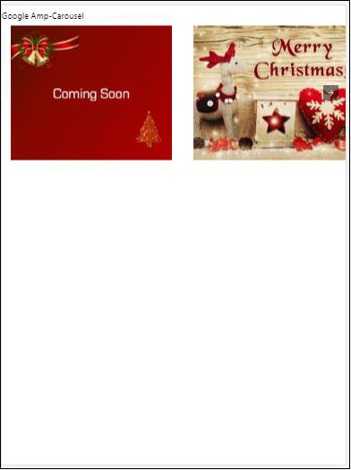
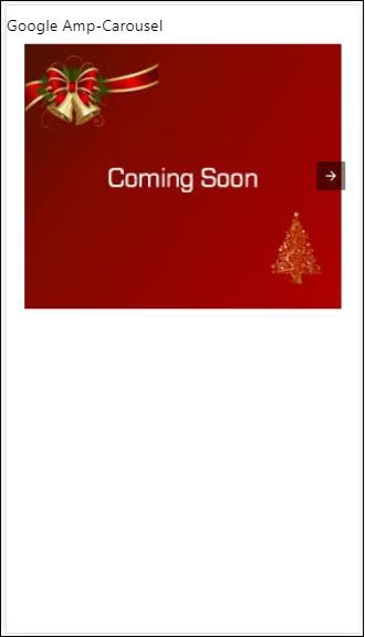
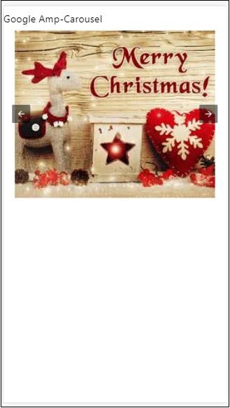
AMP Carousel
Amp-carousel 是一个 amp-component,用于在屏幕上显示一组类似的内容,并使用箭头在内容之间切换。
要使用 amp-carousel,我们需要添加以下脚本 −
<script async custom-element = "amp-carousel" src = "https://cdn.ampproject.org/v0/amp-carousel-0.1.js"></script>
Amp-carousel 标签
amp-carousel 标签如下所示 −
<amp-carousel height="300" layout="fixed-height" type="carousel">
      <amp-img src="images/christmas1.jpg" width="400" height="300" alt="a sample image"></amp-img>
   ….
</amp-carousel>
amp-carousel 可用的属性
amp-carousel 可用的属性列于下表 −
| Sr.No | 属性 &描述 |
|---|---|
| 1 | type
我们可以将轮播项目显示为轮播和幻灯片 |
| 2 | height
轮播的高度(以像素为单位) |
| 3 | controls (可选)
它在屏幕上显示左/右箭头。它在设备上几秒钟后消失。可以使用 CSS 使箭头始终可见。 |
| 4 | data-next-button-aria-label (可选)
用于设置下一个轮播的标签。 |
| 5 | data-prev-button-aria-label(可选)
用于设置上一个轮播的标签。 |
| 6 | autoplay(可选)
用于在 5000 毫秒后显示下一张幻灯片。可以使用 amp-carousel 上的延迟属性(不带毫秒)覆盖它。它将为轮播添加循环属性,幻灯片将在到达末尾后再次播放。仅适用于 type=slides,并且至少需要 2 张幻灯片才能自动播放。 |
现在,让我们通过示例来以不同方式显示轮播。
Amp 轮播类型为轮播
使用轮播类型,项目可水平滚动。
示例
<!doctype html>
<html amp lang = "en">
   <head>
      <meta charset = "utf-8">
      <title>amp-carousel</title>
      <script async src = "https://cdn.ampproject.org/v0.js">
      </script>
      <!-- ## Setup -->
      <!-- Import the carousel component in the header. -->
      <script async custom-element = "amp-carousel" src =
         "https://cdn.ampproject.org/v0/amp-carousel-0.1.js">
      </script>
      <link rel = "canonical" href="
      https://ampbyexample.com/components/amp-carousel/">
      <meta name = "viewport" content = "width = device-width,
      minimum-scale = 1,initial-scale = 1">

      <style amp-boilerplate>
         body{
            -webkit-animation:
            -amp-start 8s steps(1,end) 0s 1 normal both;-moz-animation:
            -amp-start 8s steps(1,end) 0s 1 normal both;-ms-animation:
            -amp-start 8s steps(1,end) 0s 1 normal both;animation:
            -amp-start 8s steps(1,end) 0s 1 normal both
         }
         @-webkit-keyframes
         -amp-start{from{visibility:hidden}to{visibility:visible}}@-moz-keyframes
         -amp-start{from{visibility:hidden}to{visibility:visible}}@-ms-keyframes
         -amp-start{from{visibility:hidden}to{visibility:visible}}@-o-keyframes
         -amp-start{from{visibility:hidden}to{visibility:visible}}@keyframes
         -amp-start{from{visibility:hidden}to{visibility:visible}}
      </style>

      <noscript>
         <style amp-boilerplate>
            body{
               -webkit-animation:none;
               -moz-animation:none;
               -ms-animation:none;
               animation:none
            }
         </style>
      </noscript>
      <style amp-custom>
         h3{
            font-family: "Segoe UI",Arial,sans-serif;
            font-weight: 400;
            margin: 10px 0;
         }
      </style>
   </head>
   <body>
      <h3>Google Amp-Carousel</h3>
      <amp-carousel height = "300" layout = "fixed-height" type = "carousel">
         <amp-img
            src = "images/christmas1.jpg"
            width = "400"
            height = "300"
            alt = "a sample image">
         </amp-img>
         <amp-img src = "images/christmas2.jpg"
            width = "400"
            height = "300"
            alt = "another sample image">
         </amp-img>
         <amp-img
            src = "images/christmas3.jpg"
            width = "400"
            height = "300"
            alt = "and another sample image">
         </amp-img>
      </amp-carousel>
   </body>
</html>
Output
Amp Carousel 类型为幻灯片
Amp 轮播 type = "slides" 每次显示单个项目。您可以使用以下作为布局 fill, fixed, fixed-height, flex-item, nodisplay, responsive。
示例
<!doctype html>
<html amp lang = "en">
   <head>
      <meta charset = "utf-8">
      <title>amp-carousel</title>
      <script async src = "https://cdn.ampproject.org/v0.js">
      </script>
      <!-- ## Setup -->
      <!-- Import the carousel component in the header. -->
      <script async custom-element = "amp-carousel" src =
         "https://cdn.ampproject.org/v0/amp-carousel-0.1.js">
      </script>
      <link rel = "canonical" href=
      "https://ampbyexample.com/components/amp-carousel/">
      <meta name = "viewport" content = "width = device-width,
      minimum-scale = 1,initial-scale = 1">

      <style amp-boilerplate>
         body{
            -webkit-animation:
            -amp-start 8s steps(1,end) 0s 1 normal both;-moz-animation:
            -amp-start 8s steps(1,end) 0s 1 normal both;-ms-animation:
            -amp-start 8s steps(1,end) 0s 1 normal both;animation:
            -amp-start 8s steps(1,end) 0s 1 normal both
         }
         @-webkit-keyframes
         -amp-start{from{visibility:hidden}to{visibility:visible}}@-moz-keyframes
         -amp-start{from{visibility:hidden}to{visibility:visible}}@-ms-keyframes
         -amp-start{from{visibility:hidden}to{visibility:visible}}@-o-keyframes
         -amp-start{from{visibility:hidden}to{visibility:visible}}@keyframes
         -amp-start{from{visibility:hidden}to{visibility:visible}}
      </style>

      <noscript>
         <style amp-boilerplate>
            body{
               -webkit-animation:none;
               -moz-animation:none;
               -ms-animation:none;
               animation:none}
         </style>
      </noscript>
      <style amp-custom>
         h3{
            font-family: "Segoe UI",Arial,sans-serif;
            font-weight: 400;margin: 10px 0;}
      </style>
   </head>
   <body>
      <h3>Google Amp-Carousel</h3>
         <amp-carousel
            width = "400"
            height = "300"
            layout = "responsive"
            type = "slides">
               <amp-img
                  src = "images/christmas1.jpg"
                  width = "400"
                  height = "300"
                  layout = "responsive"
                  alt = "a sample image">
               </amp-img>
               <amp-img
                  src = "images/christmas2.jpg"
                  width = "400"
                  height = "300"
                  layout = "responsive"
                  alt="another sample image">
               </amp-img>
               <amp-img
                  src = "images/christmas3.jpg"
                  width = "400"
                  height = "300"
                  layout = "responsive"
                  alt = "and another sample image">
               </amp-img>
      </amp-carousel>
   </body>
</html>
输出
使用自动播放的 Amp 轮播
在下面给出的示例中,我们添加了延迟为 2000 毫秒(2 秒)的自动播放属性。这将在延迟 2 秒后更改幻灯片。默认情况下,延迟为 5000 毫秒(5 秒)。
示例
<!doctype html>
<html amp lang = "en">
   <head>
      <meta charset = "utf-8">
      <title>amp-carousel</title>
      <script async src = "https://cdn.ampproject.org/v0.js">
      </script>
      <!-- ## Setup -->
      <!-- Import the carousel component in the header. -->
      <script async custom-element = "amp-carousel" src =
         "https://cdn.ampproject.org/v0/amp-carousel-0.1.js">
      </script>
      <link rel = "canonical" href =
      "https://ampbyexample.com/components/amp-carousel/">
      <meta name = "viewport" content = "width = device-width,
      minimum-scale = 1,initial-scale = 1">

      <style amp-boilerplate>
         body{
            -webkit-animation:
            -amp-start 8s steps(1,end) 0s 1 normal both;-moz-animation:
            -amp-start 8s steps(1,end) 0s 1 normal both;-ms-animation:
            -amp-start 8s steps(1,end) 0s 1 normal both;animation:
            -amp-start 8s steps(1,end) 0s 1 normal both
         }
         @-webkit-keyframes
         -amp-start{from{visibility:hidden}to{visibility:visible}}@-moz-keyframes
         -amp-start{from{visibility:hidden}to{visibility:visible}}@-ms-keyframes
         -amp-start{from{visibility:hidden}to{visibility:visible}}@-o-keyframes
         -amp-start{from{visibility:hidden}to{visibility:visible}}@keyframes
         -amp-start{from{visibility:hidden}to{visibility:visible}}
      </style>

      <noscript>
         <style amp-boilerplate>
            body{
               -webkit-animation:none;
               -moz-animation:none;
               -ms-animation:none;
               animation:none}
         </style>
      </noscript>
      <style amp-custom>
         h3{
            font-family: "Segoe UI",Arial,sans-serif;
            font-weight: 400;
            margin: 10px 0;
         }
      </style>
   </head>
   <body>
      <h3>Google Amp-Carousel</h3>
      <amp-carousel
         width = "400"
         height = "300"
         layout = "responsive"
         type = "slides"
         autoplay delay = "2000">
            <amp-img
               src = "images/christmas1.jpg"
               width = "400"
               height = "300"
               layout = "responsive"
               alt = "a sample image">
            </amp-img>
            <amp-img
               src = "images/christmas2.jpg"
               width = "400"
               height = "300"
               layout = "responsive"
               alt = "another sample image">
            </amp-img>
            <amp-img
               src = "images/christmas3.jpg"
               width = "400"
               height = "300"
               layout = "responsive"
               alt = "and another sample image">
            </amp-img>
      </amp-carousel>
   </body>
</html>
输出
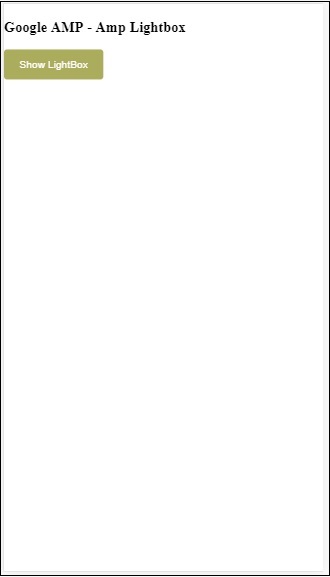
AMP Lightbox
Amp-lightbox 是一个 amp 组件,它将占据整个视口并像叠加层一样显示。
要使用 amp-lightbox,请添加以下脚本 −
<script async custom-element = "amp-lightbox" src = "https://cdn.ampproject.org/v0/amp-lightbox-0.1.js">
</script>
amp-lightbox 可用的属性
amp-lightbox 的属性列表如下 −
| Sr.no | 属性 &说明 |
|---|---|
| 1 | animate-in(可选)
您可以在此处指定打开灯箱的动画样式。默认情况下,它是 fade-in 。支持样式的值是 fade-in、fly-in-bottom 和 fly-in-top |
| 2 | close-button(AMPHTML 广告上必需)
用于 amphtmlads 时,我们可以为灯箱指定关闭按钮。 |
| 3 | id(必需)
灯箱的唯一标识符 |
| 4 | layout(必需)
layout 的值为 nodisplay |
| 5 | Scrollable (可选)
使用 amp-lightbox 上的此属性,灯箱的内容可以滚动,溢出灯箱的高度。 |
灯箱示例
<!doctype html>
<html amp lang = "en">
   <head>
      <meta charset = "utf-8">
      <script async src = "https://cdn.ampproject.org/v0.js">
      </script>
      <title>Google AMP - Amp Lightbox</title>
      <link rel = "canonical" href =
      "http://example.ampproject.org/article-metadata.html">
      <meta name = "viewport" content = "width = device-width,
      minimum-scale = 1,initial-scale = 1">
      <style amp-boilerplate>
         body{
            -webkit-animation:
            -amp-start 8s steps(1,end) 0s 1 normal both;-moz-animation:
            -amp-start 8s steps(1,end) 0s 1 normal both;-ms-animation:
            -amp-start 8s steps(1,end) 0s 1 normal both;animation:
            -amp-start 8s steps(1,end) 0s 1 normal both
         }
         @-webkit-keyframes
         -amp-start{from{visibility:hidden}to{visibility:visible}}@-moz-keyframes
         -amp-start{from{visibility:hidden}to{visibility:visible}}@-ms-keyframes
         -amp-start{from{visibility:hidden}to{visibility:visible}}@-o-keyframes
         -amp-start{from{visibility:hidden}to{visibility:visible}}@keyframes
         -amp-start{from{visibility:hidden}to{visibility:visible}}
      </style>
      <noscript>
         <style amp-boilerplate>
            body{
               -webkit-animation:none;
               -moz-animation:none;
               -ms-animation:none;
               animation:none}
         </style>
      </noscript>
      <script async custom-element = "amp-lightbox" src =
         "https://cdn.ampproject.org/v0/amp-lightbox-0.1.js">
      </script>
      <style amp-custom>
         amp-img {
            border: 1px solid #ddd;
            border-radius: 4px;
            padding: 5px;
         }
         button{
            background-color: #ACAD5C;
            color: white;
            padding: 12px 20px;
            border: none;
            border-radius: 4px;
            cursor: pointer;
            float: left;
         }
         .lightbox {
            background: rgba(211,211,211,0.8);
            width: 100%;
            height: 100%;
            position: absolute;
            display: flex;
            align-items: center;
            justify-content: center;
         }
      </style>
   </head>
   <body>
      <h3>Google AMP - Amp Lightbox</h3>
      <button on = "tap:my-lightbox">
         Show LightBox
      </button>
      <amp-lightbox id = "my-lightbox" layout = "nodisplay">
         <div class = "lightbox" on="tap:my-lightbox.close" tabindex = "0">
            <amp-img
               alt = "Beautiful Flower"
               src = "images/flower.jpg"
               width = "246"
               height = "205">
            </amp-img>
         </div>
      </amp-lightbox>
   </body>
</html>
输出
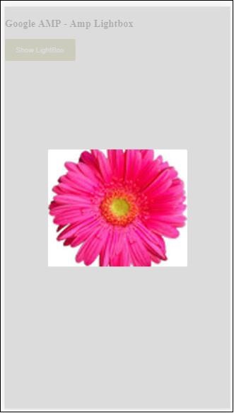
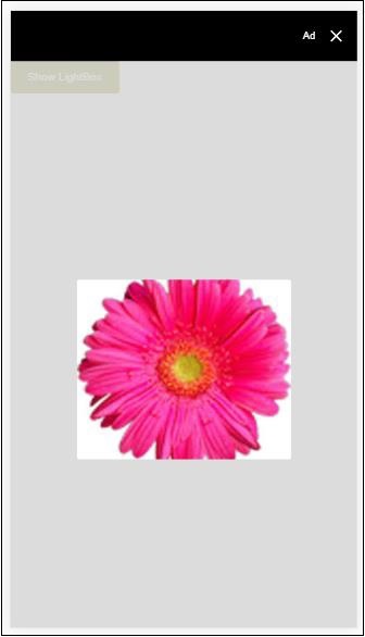
点击屏幕上的任意位置即可关闭灯箱。
您可以向灯箱添加关闭按钮,该按钮主要用于显示覆盖式广告。请观察以下示例 −
示例
<!doctype html>
<html amp lang = "en">
   <head>
      <meta charset = "utf-8">
      <script async src = "https://cdn.ampproject.org/v0.js">
      </script>
      <title>Google AMP - Amp Lightbox</title>
      <link rel = "canonical" href =
      "http://example.ampproject.org/article-metadata.html">
      <meta name = "viewport" content = "width = device-width,
      minimum-scale = 1,initial-scale = 1">

      <style amp-boilerplate>
         body{
            -webkit-animation:
               -amp-start 8s steps(1,end) 0s 1 normal both;-moz-animation:
               -amp-start 8s steps(1,end) 0s 1 normal both;-ms-animation:
               -amp-start 8s steps(1,end) 0s 1 normal both;animation:
            -amp-start 8s steps(1,end) 0s 1 normal both
         }
         @-webkit-keyframes
         -amp-start{from{visibility:hidden}to{visibility:visible}}@-moz-keyframes
         -amp-start{from{visibility:hidden}to{visibility:visible}}@-ms-keyframes
         -amp-start{from{visibility:hidden}to{visibility:visible}}@-o-keyframes
         -amp-start{from{visibility:hidden}to{visibility:visible}}@keyframes
         -amp-start{from{visibility:hidden}to{visibility:visible}}
      </style>
      <noscript>
         <style amp-boilerplate>
            body{
               -webkit-animation:none;
               -moz-animation:none;
               -ms-animation:none;
               animation:none}
         </style>
      </noscript>
      <script async custom-element = "amp-lightbox" src =
         "https://cdn.ampproject.org/v0/amp-lightbox-0.1.js">
      </script>
      <style amp-custom>
         amp-img {
            border: 1px solid #ddd;
            border-radius: 4px;
            padding: 5px;
         }
         button{
            background-color: #ACAD5C;
            color: white;
            padding: 12px 20px;
            border: none;
            border-radius: 4px;
            cursor: pointer;
            float: left;
         }
         .lightbox {
            background: rgba(211,211,211,0.8);
            width: 100%;
            height: 100%;
            position: absolute;
            display: flex;
            align-items: center;
            justify-content: center;
         }
      </style>
   </head>
   <body>
      <h3>Google AMP - Amp Lightbox</h3>
      <button on = "tap:my-lightbox">
         Show LightBox
      </button>
      <amp-lightbox id = "my-lightbox" layout = "nodisplay" close-button>
         <div class = "lightbox" on = "tap:my-lightbox.close">
            <amp-img
               alt = "Beautiful Flower"
               src = "images/flower.jpg"
               width = "246"
               height = "205">
            </amp-img>
         </div>
      </amp-lightbox>
   </body>
</html>
输出
Amp 侧边栏
Amp 侧边栏是 amp 组件,用于显示点击按钮即可从窗口两侧滑动的内容。
要使用 amp-sidebar,我们需要添加以下脚本 −
<script async custom-element = "amp-sidebar" src = "
   https://cdn.ampproject.org/v0/amp-sidebar-0.1.js">
</script>
Amp-sidebar 标签
<amp-sidebar id = "sidebar" layout = "nodisplay" side = "right">
   <span on = "tap:sidebar.close">X</span>
   Html content here..
</amp-sidebar>
amp-sidebar 上可用的属性列表如下 −
| Sr.no | 属性和说明 |
|---|---|
| 1 | side
此属性将按指定的方向打开侧边栏。示例左/右 |
| 2 | layout
侧边栏布局将使用Nodisplay |
| 3 | open
侧边栏打开时会添加此属性。 |
| 4 | data-close-button-aria-label
用于设置关闭按钮的标签。 |
我们将使用上述属性处理侧边栏。观察下面显示的示例 −
示例
<!doctype html>
<html amp lang = "en">
   <head>
      <meta charset = "utf-8">
      <script async src = "https://cdn.ampproject.org/v0.js">
      </script>
      <title>Google AMP - Amp Sidebar</title>
      <link rel = "canonical" href="
      http://example.ampproject.org/article-metadata.html">
      <meta name = "viewport" content = "width = device-width,
      minimum-scale = 1,initial-scale = 1">

      <style amp-boilerplate>
         body{
            -webkit-animation:
            -amp-start 8s steps(1,end) 0s 1 normal both;-moz-animation:
            -amp-start 8s steps(1,end) 0s 1 normal both;-ms-animation:
            -amp-start 8s steps(1,end) 0s 1 normal both;animation:
            -amp-start 8s steps(1,end) 0s 1 normal both
         }
         @-webkit-keyframes
         -amp-start{from{visibility:hidden}to{visibility:visible}}@-moz-keyframes
         -amp-start{from{visibility:hidden}to{visibility:visible}}@-ms-keyframes
         -amp-start{from{visibility:hidden}to{visibility:visible}}@-o-keyframes
         -amp-start{from{visibility:hidden}to{visibility:visible}}@keyframes
         -amp-start{from{visibility:hidden}to{visibility:visible}}
      </style>
      <noscript>
         <style amp-boilerplate>
            body{
               -webkit-animation:none;
               -moz-animation:none;
               -ms-animation:none;
               animation:none}
         </style>
      </noscript>
      <script async custom-element = "amp-sidebar" src =
         "https://cdn.ampproject.org/v0/amp-sidebar-0.1.js">
      </script>
      <style amp-custom>
         amp-img {
            border: 1px solid #ddd;
            border-radius: 4px;
            padding: 5px;
         }
         button{
            background-color: #ACAD5C;
            color: white;
            padding: 12px 20px;
            border: none;
            border-radius: 4px;
            cursor: pointer;
            float: left;
         }
      </style>
   </head>
   <body>
      <h3>Google AMP - Amp Sidebar</h3>
      <button on = "tap:sidebar">
         Show Sidebar
      </button>
      <amp-sidebar id = "sidebar" layout = "nodisplay" side = "right">
         <span on = "tap:sidebar.close">X</span>
         <ul>
            <li><a href = "/">About</a></li>
            <li><a href = "/">Services</a></li>
            <li><a href = "/">Contact US</a></li>
         </ul>
      </amp-sidebar>
   </body>
</html>
输出
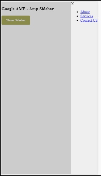
我们使用 side 属性在右侧打开侧边栏。您可以使用 side 属性的 left 值在左侧打开侧边栏。layout 属性必须为 nodisplay.Open 属性,侧边栏打开时才会显示该属性。
data-close-button-aria-label
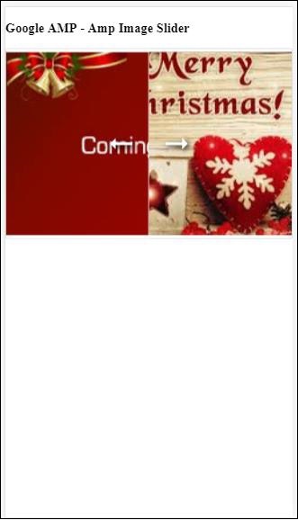
属性用于添加关闭按钮。它是可选的,并非强制使用。Amp Image Slider
Amp-image-slider 是一个 amp 组件,用于通过在图像上垂直移动滑块来比较两幅图像。
要使用 amp-img-slider,请添加以下脚本 −
<script async custom-element = "amp-image-slider" src = "
   https://cdn.ampproject.org/v0/amp-image-slider-0.1.js">
</script>
Amp-img-slider 标签
<amp-image-slider width = "300" height = "200" layout = "responsive">
   <amp-img src = "images/christmas1.jpg" layout = "fill">
   </amp-img>
   <amp-img src = "images/christmas2.jpg" layout = "fill">
   </amp-img>
</amp-image-slider>
此处显示了 amp-img-slider 的一个示例。我们在 amp-img-slider 中添加了 2 张图片,其中第一张图片充当滑块,您可以在第二张图片的顶部滑入。
示例
<!doctype html>
<html amp lang = "en">
   <head>
      <meta charset = "utf-8">
      <script async src = "https://cdn.ampproject.org/v0.js">
      </script>
      <title>Google AMP - Amp Image Slider</title>
      <link rel = "canonical" href =
      "http://example.ampproject.org/article-metadata.html">
      <meta name = "viewport" content = "width = device-width,
      minimum-scale = 1,initial-scale = 1">

      <style amp-boilerplate>
         body{
            -webkit-animation:
            -amp-start 8s steps(1,end) 0s 1 normal both;-moz-animation:
            -amp-start 8s steps(1,end) 0s 1 normal both;-ms-animation:
            -amp-start 8s steps(1,end) 0s 1 normal both;animation:
            -amp-start 8s steps(1,end) 0s 1 normal both
         }
         @-webkit-keyframes
         -amp-start{from{visibility:hidden}to{visibility:visible}}@-moz-keyframes
         -amp-start{from{visibility:hidden}to{visibility:visible}}@-ms-keyframes
         -amp-start{from{visibility:hidden}to{visibility:visible}}@-o-keyframes
         -amp-start{from{visibility:hidden}to{visibility:visible}}@keyframes
         -amp-start{from{visibility:hidden}to{visibility:visible}}
      </style>
      <noscript>
         <style amp-boilerplate>
            body{
               -webkit-animation:none;
               -moz-animation:none;
               -ms-animation:none;
               animation:none}
         </style>
      </noscript>
      <script async custom-element = "amp-image-slider" src =
         "https://cdn.ampproject.org/v0/amp-image-slider-0.1.js">
      </script>
      <style amp-custom>
         amp-img {
            border: 1px solid #ddd;
            border-radius: 4px;
            padding: 5px;
         }
      </style>
   </head>
   <body>
      <h3>Google AMP - Amp Image Slider</h3>
      <amp-image-slider
         width = "300"
         height = "200"
         layout = "responsive">
            <amp-img
               src = "images/christmas1.jpg"
               layout = "fill">
            </amp-img>
            <amp-img
               src = "images/christmas2.jpg"
               layout = "fill">
            </amp-img>
      </amp-image-slider>
   </body>
</html>
输出
Amp-image-slider 具有名为 seekTo 的操作,您可以使用该操作更改图像,如下例所示 −
示例
<!doctype html>
<html amp lang = "en">
   <head>
      <meta charset = "utf-8">
      <script async src = "https://cdn.ampproject.org/v0.js">
      </script>
      <title>Google AMP - Amp Image Slider</title>
      <link rel = "canonical" href ="
      http://example.ampproject.org/article-metadata.html">
      <meta name = "viewport" content = "width = device-width,
      minimum-scale = 1,initial-scale = 1">

      <style amp-boilerplate>
         body{
            -webkit-animation:
            -amp-start 8s steps(1,end) 0s 1 normal both;-moz-animation:
            -amp-start 8s steps(1,end) 0s 1 normal both;-ms-animation:
            -amp-start 8s steps(1,end) 0s 1 normal both;animation:
            -amp-start 8s steps(1,end) 0s 1 normal both
         }
         @-webkit-keyframes
         -amp-start{from{visibility:hidden}to{visibility:visible}}@-moz-keyframes
         -amp-start{from{visibility:hidden}to{visibility:visible}}@-ms-keyframes
         -amp-start{from{visibility:hidden}to{visibility:visible}}@-o-keyframes
         -amp-start{from{visibility:hidden}to{visibility:visible}}@keyframes
         -amp-start{from{visibility:hidden}to{visibility:visible}}
      </style>
      <noscript>
         <style amp-boilerplate>
            body{
               -webkit-animation:none;
               -moz-animation:none;
               -ms-animation:none;
               animation:none}
         </style>
      </noscript>
      <script async custom-element = "amp-image-slider" src =
         "https://cdn.ampproject.org/v0/amp-image-slider-0.1.js">
      </script>
      <style amp-custom>
         amp-img {
            border: 1px solid #ddd;
            border-radius: 4px;
            padding: 5px;
         }
         button{
            background-color: #ACAD5C;
            color: white;
            padding: 12px 20px;
            border: none;
            border-radius: 4px;
            cursor: pointer;
            float: left;
         }
         .amp-sidebar-toolbar-target-shown {
            display: none;
         }
      </style>
   </head>
   <body>
      <h3>Google AMP - Amp Image Slider</h3>
      <amp-image-slider
         width = "300"
         id="slider1"
         height = "200"
         layout = "responsive">
         <amp-img src = "images/christmas1.jpg" layout = "fill">
         </amp-img>
         <amp-img src = "images/christmas2.jpg" layout = "fill">
         </amp-img>
      </amp-image-slider>
      <button on = "tap:slider1.seekTo(percent = 1)">
         Image 1
      </button>
      <button on = "tap:slider1.seekTo(percent = 0)">
         Image 2
      </button>
   </body>
</html>
输出
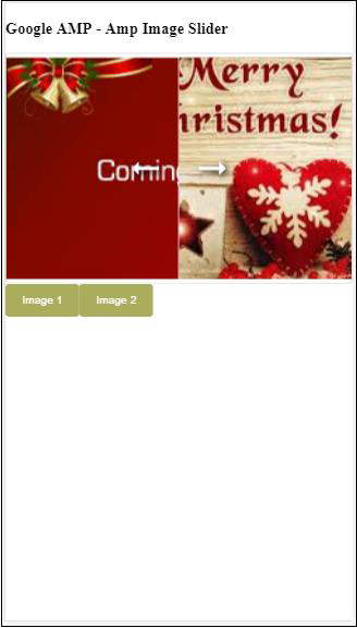
您可以通过点击按钮来更改图像。
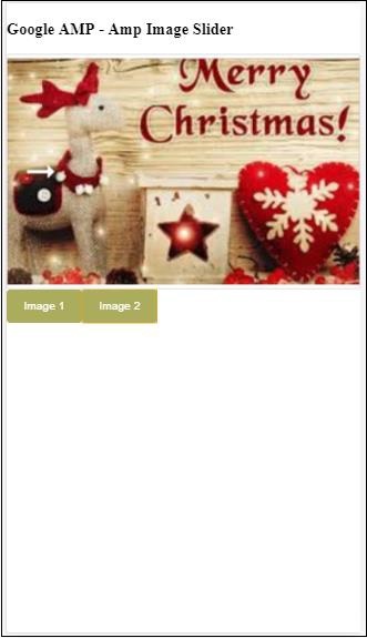
<button on = "tap:slider1.seekTo(percent = 1)">Image 1</button>
<button on = "tap:slider1.seekTo(percent = 0)">Image 2</button>
</div>


