Materialize - 对话框
Materialize 提供各种特殊方法向用户显示不显眼的警报。Materialize 为他们提供了一个术语提示框。以下是将对话框显示为提示框的语法。
Materialize.toast(message, displayLength, className, completeCallback);
其中,
- message − 要显示给用户的消息。
- displayLength − 消息的持续时间,在此时间之后消息将消失。
- className − 要应用于提示框的样式类。例如,"rounded"。
- completeCallback −一旦提示框消失,将调用回调方法。
对于工具提示,Materialize 提供了以下 CSS 类。
| Sr.No. | 类名和说明 |
|---|---|
| 1 | tooltipped 标识具有工具提示的组件。 |
| 2 | data-position 工具提示的位置;底部、顶部、左侧或右侧。 |
| 3 | data-delay 设置工具提示的持续时间,超过此时间后工具提示将消失。 |
| 4 | data-tooltip 设置工具提示内容。 |
示例
以下示例演示了如何使用提示框和工具提示。
<html>
   <head>
      <title>The Materialize Dialogs Example</title>
         <meta name="viewport" content="width=device-width, initial-scale=1">
         <link rel="stylesheet" href="https://fonts.googleapis.com/icon?family=Material+Icons">
         <link rel="stylesheet" href="https://cdnjs.cloudflare.com/ajax/libs/materialize/0.97.3/css/materialize.min.css">
         <script type="text/javascript" src="https://code.jquery.com/jquery-2.1.1.min.js"></script>
         <script src="https://cdnjs.cloudflare.com/ajax/libs/materialize/0.97.3/js/materialize.min.js"></script>
         <script>
            function showToast(message, duration){
               Materialize.toast(message, duration);
            }
            function showToast1(message, duration){
               Materialize.toast('<i>'+ message + '</i>', duration);
            }
            function showToast2(message, duration){
               Materialize.toast(message, duration, 'rounded');
            }
            function showToast3(message, duration){
               Materialize.toast('Hello World!', duration, '', function toastCompleted(){
                     alert('Toast dismissed!');
            });
         }
      </script>
   </head>
   <body class="container">
      <h4>Toasts</h4>
      <a class="btn" onclick="showToast('Hello World!', 3000)">Normal Alert!</a>
      <a class="btn" onclick="showToast1('Hello World!', 3000)">Italic Alert!</a>
      <a class="btn" onclick="showToast2('Hello World!', 3000)">Rounded Alert!</a>
      <br/><br/>
      <a class="btn" onclick="showToast3('Hello World!', 3000)">Callback Alert!</a>
      <h4>Tooltips</h4>
      <a class="btn tooltipped" data-position="bottom" data-delay="50" data-tooltip="I am in bottom!">Bottom</a>
      <a class="btn tooltipped" data-position="left" data-delay="50" data-tooltip="I am in left!">Left</a>
      <a class="btn tooltipped" data-position="right" data-delay="50" data-tooltip="I am in right!">Right</a>
      <a class="btn tooltipped" data-position="top" data-delay="50" data-tooltip="I am in top!">Top</a>
   </body>
</html>
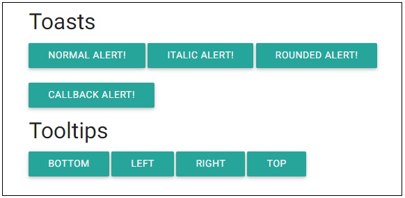
输出
验证输出。