Ngx-Bootstrap - Tabs
ngx-bootstrap tabs 组件提供了一个易于使用且高度可配置的 Tab 组件。
TabsetComponent
选择器
tabset
输入
justified − 布尔值,如果为真,则选项卡填充容器并具有一致的宽度。
type − 字符串,导航上下文类:'tabs' 或 'pills'。
vertical −如果为 true,则选项卡将垂直放置。
TabDirective
选择器
tab,[tab]
输入
active − 布尔值,选项卡活动状态切换。
customClass − 字符串,如果设置,将添加到选项卡的 class 属性中。支持多个类。
disabled − 布尔值,如果为 true,则无法激活选项卡。
heading − 字符串,选项卡标题文本。
id −字符串,选项卡 ID。相同的 ID 加上后缀"-link"将被添加到相应的
- 元素。
removable − 布尔值,如果为 true,选项卡可以移除,则会出现附加按钮。
输出
deselect − 在选项卡变为非活动状态时触发,$event:Tab 等于取消选择的 Tab 组件实例。
removed − 在选项卡被移除之前触发,$event:Tab 等于被移除选项卡的实例。
selectTab −当选项卡变为活动状态时触发,$event:Tab 等于选定的 Tab 组件实例。
示例
由于我们要使用 Tab,因此我们必须更新 ngx-bootstrap Sortable 一章中使用的 app.module.ts 以使用 TabsModule 和 TabsetConfig。
更新 app.module.ts 以使用 TabsModule 和 TabsetConfig。
app.module.ts
import { BrowserModule } from '@angular/platform-browser';
import { NgModule } from '@angular/core';
import { BrowserAnimationsModule } from '@angular/platform-browser/animations';
import { AppComponent } from './app.component';
import { TestComponent } from './test/test.component';
import { AccordionModule } from 'ngx-bootstrap/accordion';
import { AlertModule,AlertConfig } from 'ngx-bootstrap/alert';
import { ButtonsModule } from 'ngx-bootstrap/buttons';
import { FormsModule } from '@angular/forms';
import { CarouselModule } from 'ngx-bootstrap/carousel';
import { CollapseModule } from 'ngx-bootstrap/collapse';
import { BsDatepickerModule, BsDatepickerConfig } from 'ngx-bootstrap/datepicker';
import { BsDropdownModule,BsDropdownConfig } from 'ngx-bootstrap/dropdown';
import { PaginationModule,PaginationConfig } from 'ngx-bootstrap/pagination';
import { PopoverModule, PopoverConfig } from 'ngx-bootstrap/popover';
import { ProgressbarModule,ProgressbarConfig } from 'ngx-bootstrap/progressbar';
import { RatingModule, RatingConfig } from 'ngx-bootstrap/rating';
import { SortableModule, DraggableItemService } from 'ngx-bootstrap/sortable';
import { TabsModule, TabsetConfig } from 'ngx-bootstrap/tabs';

@NgModule({
   declarations: [
      AppComponent,
      TestComponent
   ],
   imports: [
      BrowserAnimationsModule,
      BrowserModule,
      AccordionModule,
      AlertModule,
      ButtonsModule,
      FormsModule,
      CarouselModule,
      CollapseModule,
      BsDatepickerModule.forRoot(),
      BsDropdownModule,
      ModalModule,
      PaginationModule,
      PopoverModule,
      ProgressbarModule,
      RatingModule,
      SortableModule,
      TabsModule
   ],
   providers: [AlertConfig,
      BsDatepickerConfig,
      BsDropdownConfig,
      BsModalService,
      PaginationConfig,
      ProgressbarConfig,
      RatingConfig,
      DraggableItemService,
      TabsetConfig],
   bootstrap: [AppComponent]
})
export class AppModule { }
更新 test.component.html 以使用选项卡组件。
test.component.html
<tabset>
   <tab heading="Home">Home</tab>
   <tab *ngFor="let tabz of tabs"
      [heading]="tabz.title"
      [active]="tabz.active"
      (selectTab)="tabz.active = true"
      [disabled]="tabz.disabled">
      {{tabz?.content}}
   </tab>
</tabset>
更新 test.component.ts 以获取相应的变量和方法。
test.component.ts
import { Component, OnInit } from '@angular/core';

@Component({
   selector: 'app-test',
   templateUrl: './test.component.html',
   styleUrls: ['./test.component.css']
})
export class TestComponent implements OnInit {
   tabs = [
      { title: 'First', content: 'First Tab Content' },
      { title: 'Second', content: 'Second Tab Content', active: true },
      { title: 'Third', content: 'Third Tab Content', removable: true },
      { title: 'Four', content: 'Fourth Tab Content', disabled: true }
   ];
   constructor() {}
   ngOnInit(): void {
   }
}
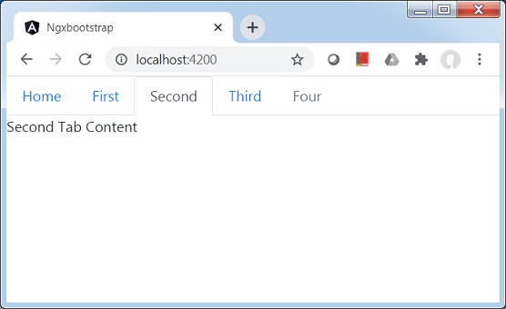
构建和服务
运行以下命令启动 angular 服务器。
ng serve
服务器启动并运行后。打开 http://localhost:4200。单击"打开模式"按钮并验证以下输出。