Plotly - 子图和插入图
在这里,我们将了解 Plotly 中的子图和插入图的概念。
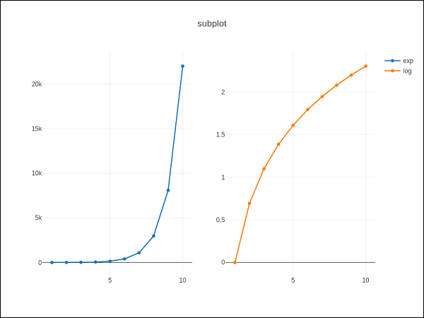
制作子图
有时并排比较数据的不同视图会很有帮助。这支持子图的概念。它在 plotly.tools 模块 中提供了 make_subplots() 函数。该函数返回一个 Figure 对象。
以下语句在一行中创建两个子图。
fig = tools.make_subplots(rows = 1, cols = 2)
我们现在可以向图中添加两个不同的轨迹(上例中的 exp 和 log 轨迹)。
fig.append_trace(trace1, 1, 1)
fig.append_trace(trace2, 1, 2)
通过使用 update() 方法指定 title、width、height 等,可以进一步配置图的布局。
fig['layout'].update(height = 600, width = 800s, title = 'subplots')
这是完整的脚本 −
from plotly import tools
import plotly.plotly as py
import plotly.graph_objs as go
from plotly.offline import iplot, init_notebook_mode
init_notebook_mode(connected = True)
import numpy as np
x = np.arange(1,11)
y1 = np.exp(x)
y2 = np.log(x)
trace1 = go.Scatter(
   x = x,
   y = y1,
   name = 'exp'
)
trace2 = go.Scatter(
   x = x,
   y = y2,
   name = 'log'
)
fig = tools.make_subplots(rows = 1, cols = 2)
fig.append_trace(trace1, 1, 1)
fig.append_trace(trace2, 1, 2)
fig['layout'].update(height = 600, width = 800, title = 'subplot')
iplot(fig)
这是您的绘图网格的格式:[ (1,1) x1,y1 ] [ (1,2) x2,y2 ]
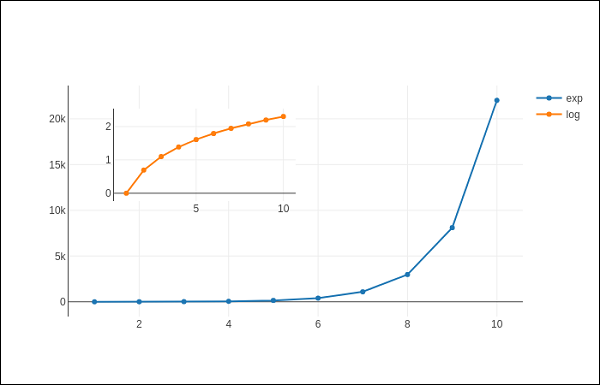
插入图
要将子图显示为插入图,我们需要配置其跟踪对象。首先,将插入图的 xaxis 和 yaxis 属性分别跟踪到 'x2' 和 'y2'。以下语句将 'log' 跟踪放入插入图中。
trace2 = go.Scatter(
   x = x,
   y = y2,
   xaxis = 'x2',
   yaxis = 'y2',
   name = 'log'
)
其次,配置布局对象,其中插入的 x 和 y 轴的位置由 domain 属性定义,该属性指定相对于主轴的位置。
xaxis2=dict(
   domain = [0.1, 0.5],
   anchor = 'y2'
),
yaxis2 = dict(
   domain = [0.5, 0.9],
   anchor = 'x2'
)
在插图中显示对数跟踪并在主轴上显示指数跟踪的完整脚本如下 −
trace1 = go.Scatter(
   x = x,
   y = y1,
   name = 'exp'
)
trace2 = go.Scatter(
   x = x,
   y = y2,
   xaxis = 'x2',
   yaxis = 'y2',
   name = 'log'
)
data = [trace1, trace2]
layout = go.Layout(
   yaxis = dict(showline = True),
   xaxis2 = dict(
      domain = [0.1, 0.5],
      anchor = 'y2'
   ),
   yaxis2 = dict(
      showline = True,
      domain = [0.5, 0.9],
      anchor = 'x2'
   )
)
fig = go.Figure(data=data, layout=layout)
iplot(fig)
输出如下所示 −