R 饼图
饼图
饼图是数据的圆形图形视图。
使用pie()函数绘制饼图:

示例说明
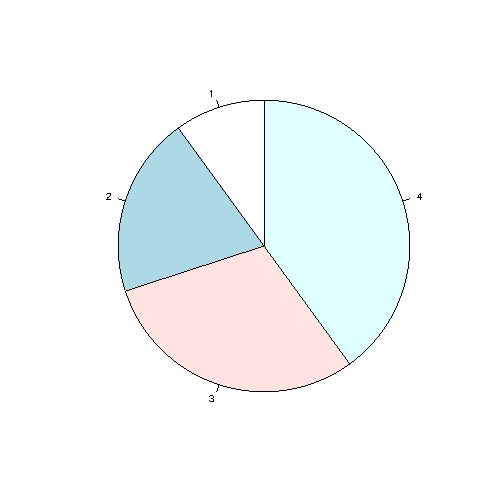
如您所见,饼图为向量中的每个值(在本例中为 10、20、30、40)绘制一个饼图。
默认情况下,第一个饼图的绘制从 x 轴开始并逆时针移动。
注意:每个饼的大小是通过将该值与所有其他值进行比较来确定的,使用以下公式:
该值除以所有值之和:x/sum(x)
起始角度
您可以通过init.angle参数更改饼图的起始角度。
init.angle的值以角度为单位定义,默认角度为0。
实例
从 90 度开始第一个饼图:
# 创建饼图向量
x <- c(10,20,30,40)
# 显示饼图并以 90 度开始第一个饼图
pie(x, init.angle = 90)
结果:
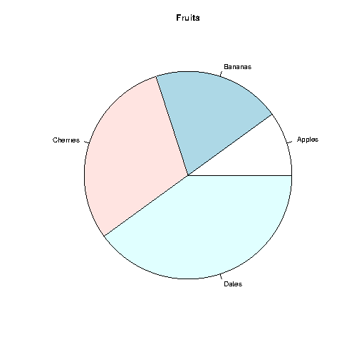
标签和标题
使用label参数给饼图添加标签,使用main参数 添加标题:
实例
# 创建饼图向量
x <- c(10,20,30,40)
# 创建标签向量
mylabel <- c("Apples",
"Bananas", "Cherries", "Dates")
# 显示带有标签的饼图
pie(x, label = mylabel, main = "Fruits")
结果:
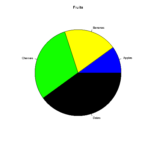
Colors
您可以使用 col 参数为每个饼图添加颜色:
实例
# 创建颜色向量
colors <- c("blue", "yellow", "green", "black")
# 用颜色显示饼图
pie(x, label = mylabel, main =
"Fruits", col = colors)
结果:
Legend
要为每个饼图添加解释列表,请使用 legend() 函数:
实例
# 创建标签向量
mylabel <- c("Apples", "Bananas", "Cherries",
"Dates")
# 创建颜色向量
colors <- c("blue", "yellow",
"green", "black")
# 用颜色显示饼图
pie(x, label = mylabel,
main = "Pie Chart", col = colors)
# 显示说明框
legend("bottomright", mylabel, fill = colors)
结果:
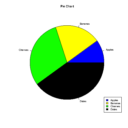
图例可以定位为:
bottomright,
bottom,
bottomleft,
left,
topleft,
top,
topright,
right,
center