如何在 Matplotlib 中根据直方图数据绘制线图?
matplotlibpythondata visualization
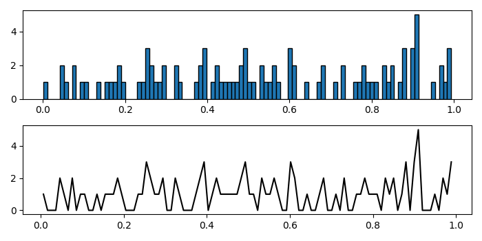
要在 matplotlib 中根据直方图数据绘制线图,我们使用 numpy 直方图方法计算一组数据的直方图。
步骤
向当前图形添加子图,nrows=2、ncols=1 和 index=1。
使用 numpy 直方图方法获取一组数据的直方图。
使用 hist() 方法绘制直方图,其中 edgecolor=black。
在索引 2 处,使用计算数据(来自 numpy 直方图)。要绘制它们,我们可以使用 plot() 方法。
要显示图形,请使用show() 方法。
示例
import numpy as np
from matplotlib import pyplot as plt
plt.rcParams["figure.figsize"] = [7.00, 3.50]
plt.rcParams["figure.autolayout"] = True
plt.subplot(211)
data = np.array(np.random.rand(100))
y, binEdges = np.histogram(data, bins=100)
plt.hist(data, bins=100, edgecolor='black')
plt.subplot(212)
bincenters = 0.5 * (binEdges[1:] + binEdges[:-1])
plt.plot(bincenters, y, '-', c='black')
plt.show()
输出