如何在 Matplotlib 中制作联合双变量分布?
matplotlibpythondata visualization
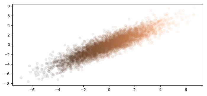
要在 matplotlib 中制作联合双变量分布,我们可以使用 scatter 方法。
步骤
设置图形大小并调整子图之间和周围的填充。
使用 numpy 创建 x 和 y 数据点。
创建一个图形和一组子图。
使用 scatter() 方法绘制 x 和 y。
要显示图形,请使用 show() 方法。
示例
import numpy as np
from matplotlib import pyplot as plt

plt.rcParams["figure.figsize"] = [7.50, 3.50]
plt.rcParams["figure.autolayout"] = True

x = 2 * np.random.randn(5000)
y = x + np.random.randn(5000)

fig, ax = plt.subplots()
_ = ax.scatter(x, y, alpha=0.08, cmap="copper", c=x)

plt.show()
输出