如何在 Matplotlib 中的地图中插入比例尺?
matplotlibpythondata visualization
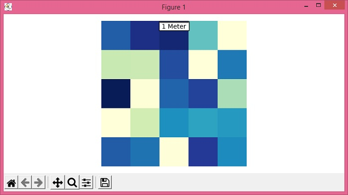
要在 matplotlib 中的地图中插入比例尺,我们可以使用 AnchoredBar() 类来实例化比例尺对象。
步骤
设置图形大小并调整子图之间和周围的填充。
使用 numpy 创建随机数据。
使用 imshow() 方法将数据显示为图像,即在 2D 常规栅格上。
使用 gca() 方法获取当前轴。
绘制一个水平比例尺,下方有一个居中对齐的标签。
将比例尺艺术家添加到当前轴。
关闭轴。
要显示图形,请使用 show() 方法。
示例
from matplotlib import pyplot as plt
from mpl_toolkits.axes_grid1.anchored_artists import AnchoredSizeBar
import numpy as np

plt.rcParams["figure.figsize"] = [7.50, 3.50]
plt.rcParams["figure.autolayout"] = True

data = np.random.rand(5, 5)

img = plt.imshow(data, cmap="YlGnBu")
ax = plt.gca()
scalebar = AnchoredSizeBar(ax.transData, 1, "1 Meter", 9)

ax.add_artist(scalebar)
ax.axis('off')
plt.show()
输出