如何创建带有阈值线的 Matplotlib 条形图?
matplotlibpythondata visualization
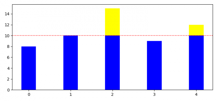
要创建带有阈值线的 Matplotlib 条形图,我们必须使用 axhline() 方法。
步骤
- 设置图形大小并调整子图之间和周围的填充。
- 初始化变量 threshold。
- 为 bars 值创建列表。
- 根据阈值获取低于和高于条形值。
- 使用 subplots() 方法创建一个图形和一组子图。
- 使用 x、a_threshold 和 b_threshold 值绘制条形图。
- 添加使用 axhline() 方法绘制横跨轴的水平线。
- 要显示图形,请使用 show() 方法。
示例
import numpy as np
import matplotlib.pyplot as plt

plt.rcParams["figure.figsize"] = [7.50, 3.50]
plt.rcParams["figure.autolayout"] = True
threshold = 10
values = np.array([8.0, 10.0, 15.0, 9.0, 12.0])
x = range(len(values))

a_threshold = np.maximum(values - threshold, 0)
b_threshold = np.minimum(values, threshold)

fig, ax = plt.subplots()
ax.bar(x, b_threshold, 0.35, color="blue")
ax.bar(x, a_threshold, 0.35, color="yellow", bottom=b_threshold)

plt.axhline(threshold, color='red', ls='dotted')

plt.show()
输出