如何在 Matplotlib 中为 hist2d 图添加颜色条?
matplotlibpythondata visualization
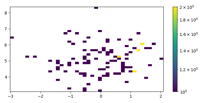
要为 hist2d 图添加颜色条,我们可以将标量可映射对象传递给 colorbar() 方法的参数。
步骤
使用 numpy 创建 x 和 y 数据点。
使用 subplots() 方法创建一个图形和一组子图。
使用 hist2d() 方法制作 2D 直方图。
为 hist2d 标量可映射实例创建颜色条。
要显示图形,请使用 show()方法。
示例
import numpy as np
from matplotlib import pyplot as plt, colors
plt.rcParams["figure.figsize"] = [7.00, 3.50]
plt.rcParams["figure.autolayout"] = True
x = np.random.randn(100)
y = np.random.randn(100) + 5
fig, ax = plt.subplots()
hh = ax.hist2d(x, y, bins=40, norm=colors.LogNorm())
fig.colorbar(hh[3], ax=ax)
plt.show()
输出