XAML - 触发器
基本上,触发器使您能够更改属性值或根据属性值采取行动。因此,它基本上允许您动态更改控件的外观和/或行为,而无需创建新控件。
触发器用于在满足某些条件时更改任何给定属性的值。触发器通常在样式中或文档的根目录中定义,并应用于该特定控件。有三种类型的触发器 −
- 属性触发器
- 数据触发器
- 事件触发器
属性触发器
在属性触发器中,当一个属性发生变化时,它将立即或以动画方式更改另一个属性。例如,如果您想在鼠标悬停在按钮上时更改按钮的外观,则可以使用属性触发器。
示例
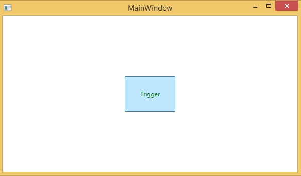
以下示例演示了如何在鼠标进入按钮区域时更改按钮的前景色。
<Window x:Class = "XAMLPropertyTriggers.MainWindow"
   xmlns = "http://schemas.microsoft.com/winfx/2006/xaml/presentation"
   xmlns:x = "http://schemas.microsoft.com/winfx/2006/xaml"
   Title = "MainWindow" Height = "350" Width = "604">

   <Window.Resources>
      <Style x:Key = "TriggerStyle" TargetType = "Button">
         <Setter Property = "Foreground" Value = "Blue" />
         <Style.Triggers>
            <Trigger Property = "IsMouseOver" Value = "True">
               <Setter Property = "Foreground" Value = "Green" />
            </Trigger>
         </Style.Triggers>
      </Style>
   </Window.Resources>

   <Grid>
      <Button Width = "100" Height = "70" Style = "{StaticResource TriggerStyle}"
         Content = "Trigger"/>
   </Grid>

</Window>
编译并执行上述代码时,将产生以下输出 −
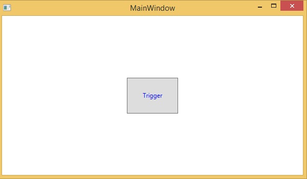
当鼠标进入按钮区域时,前景色将变为绿色。
数据触发器
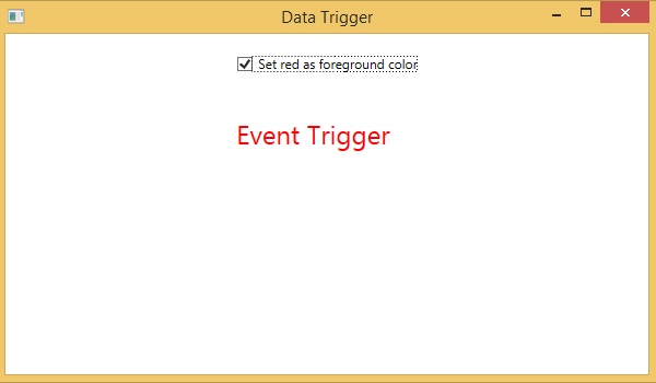
当绑定数据满足某些条件时,数据触发器会执行某些操作。让我们看一下以下 XAML 代码,其中使用一些属性创建了一个复选框和一个文本块。选中复选框后,它会将前景色更改为红色。
<Window x:Class = "XAMLDataTrigger.MainWindow"
   xmlns = "http://schemas.microsoft.com/winfx/2006/xaml/presentation"
   xmlns:x = "http://schemas.microsoft.com/winfx/2006/xaml"
   Title = "Data Trigger" Height = "350" Width = "604">

   <StackPanel HorizontalAlignment = "Center">
      <CheckBox x:Name = "redColorCheckBox" Content = "Set red as foreground color" Margin = "20"/>

      <TextBlock Name = "txtblock" VerticalAlignment = "Center"
         Text = "Event Trigger" FontSize = "24" Margin = "20">
         <TextBlock.Style>
            <Style>
               <Style.Triggers>
                  <DataTrigger Binding = "{Binding ElementName = redColorCheckBox, Path = IsChecked}"
                     Value = "true">
                     <Setter Property = "TextBlock.Foreground" Value = "Red"/>
                     <Setter Property = "TextBlock.Cursor" Value = "Hand" />
                  </DataTrigger>
               </Style.Triggers>
            </Style>
         </TextBlock.Style>
      </TextBlock>
   </StackPanel>

</Window>
编译并执行上述代码时,将产生以下输出 −
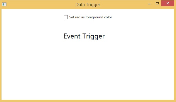
选中复选框后,文本块的前景色将变为红色。
事件触发器
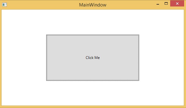
事件触发器在触发特定事件时执行某些操作。它通常用于完成一些动画,如 DoubleAnimation、ColorAnimation 等。以下代码块创建了一个简单的按钮。当触发单击事件时,它将扩展按钮的宽度和高度。
<Window x:Class = "XAMLEventTrigger.MainWindow"
   xmlns = "http://schemas.microsoft.com/winfx/2006/xaml/presentation"
   xmlns:x = "http://schemas.microsoft.com/winfx/2006/xaml"
   Title = "MainWindow" Height = "350" Width = "604">

   <Grid>
      <Button Content = "Click Me" Width = "60" Height = "30">
         <Button.Triggers>
            <EventTrigger RoutedEvent = "Button.Click">
               <EventTrigger.Actions>
                  <BeginStoryboard>
                     <Storyboard>

                        <DoubleAnimationUsingKeyFrames Storyboard.TargetProperty = "Width" Duration = "0:0:4">
                           <LinearDoubleKeyFrame Value = "60" KeyTime = "0:0:0"/>
                           <LinearDoubleKeyFrame Value = "120" KeyTime = "0:0:1"/>
                           <LinearDoubleKeyFrame Value = "200" KeyTime = "0:0:2"/>
                           <LinearDoubleKeyFrame Value = "300" KeyTime = "0:0:3"/>
                        </DoubleAnimationUsingKeyFrames>

                        <DoubleAnimationUsingKeyFrames Storyboard.TargetProperty = "Height" Duration = "0:0:4">
                           <LinearDoubleKeyFrame Value = "30" KeyTime = "0:0:0"/>
                           <LinearDoubleKeyFrame Value = "40" KeyTime = "0:0:1"/>
                           <LinearDoubleKeyFrame Value = "80" KeyTime = "0:0:2"/>
                           <LinearDoubleKeyFrame Value = "150" KeyTime = "0:0:3"/>
                        </DoubleAnimationUsingKeyFrames>

                     </Storyboard>
                  </BeginStoryboard>
               </EventTrigger.Actions>
            </EventTrigger>
         </Button.Triggers>
      </Button>
   </Grid>
</Window>
当您编译并执行上述代码时,它将产生以下输出 −
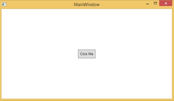
现在,单击按钮,您将观察到它将开始在两个维度上扩展。