CSS 技术
对于 Web 开发人员来说,在创建视差滚动效果时,有各种技术可用。其中一种技术是使用层叠样式表 (CSS)。
CSS 解释了 HTML 元素在屏幕上的显示方式。可以创建一个 CSS 文件,并将其用于整个网站。添加 CSS 文件比向每个 HTML 元素添加样式并在网页的不同部分管理它们更简单。
注意 − 本章下面讨论的一些方法特定于台式计算机,不适用于移动设备。当某种技术不适合移动设备时,将在步骤中提及。
考虑到 CSS 将所有额外的绘制卸载到文档对象模型 (DOM) 中,可以更好地利用硬件加速,并且不会给 CPU 带来负担,从而实现流畅的效果。
绝对定位方法
此方法经常用于创建视差效果,因为与其他可用选项相比,这种方法相对较轻。背景图像的位置相对于屏幕上的其他内容保持固定。在下面讨论的示例中,您将看到如何使用 CSS 的魔力来实现这一点。
在本节中,我们将介绍两种绝对定位方法 −
- 单一背景
- 多重背景
单一背景方法
在此方法中,我们将在同一个文件夹中创建两个文件。遵循下面给出的步骤以达到相同的目的 −
步骤 1
我们必须在同一个文件夹中创建两个文件:第一个文件包含 HTML 标记,第二个文件包含 CSS 代码。
步骤 2
现在,让我们定义我们的 HTML 标记。遵循下面给出的代码 −
<html>
   <head>
      <link rel = "stylesheet" href = "styles.css">
   </head>
   <body>
      <div class = "BgContainer">
         <div class = "Parallax">
            <h1> Welcome! </h1>
         </div>
         <div class = "FgContainer">
            <div class = "MainContent">
               <p>
                  Here we will go ahead with some content which will really vary
                  according to the content on your site. I am just typing out this
                  content as it is sometimes good to engage user than the usual lorem
                  ipsum text!
                  <br/>
                  <br/>

                  Lorem ipsum dolor sit amet, consectetur adipiscing elit, sed do
                  eiusmod tempor incididunt ut labore et dolore magna aliqua. Ut enim
                  ad minim veniam, quis nostrud exercitation ullamco laboris nisi ut
                  aliquip ex ea commodo consequat. Duis aute irure dolor in
                  reprehenderit in voluptate velit esse cillum dolore eu fugiat nulla
                  pariatur. Excepteur sint occaecat cupidatat non proident, sunt in
                  culpa qui officia deserunt mollit anim id est laborum.
                  <br/>
                  <br/>

                  Lorem ipsum dolor sit amet, consectetur adipiscing elit, sed do
                  eiusmod tempor incididunt ut labore et dolore magna aliqua. Ut enim
                  ad minim veniam, quis nostrud exercitation ullamco laboris nisi ut
                  aliquip ex ea commodo consequat. Duis aute irure dolor in
                  reprehenderit in voluptate velit esse cillum dolore eu fugiat nulla
                  pariatur. Excepteur sint occaecat cupidatat non proident, sunt in
                  culpa qui officia deserunt mollit anim id est laborum.
               </p>
            </div>
         </div>
      </div>
   </body>

</html>
步骤 3
打开记事本。复制并粘贴上述代码片段。
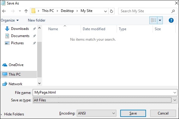
保存文件时,在保存类型下,选择所有文件。根据需要输入文件名称,但后面需要加上扩展名 − .html,如下面的屏幕截图所示。
步骤 4
保存文件后,在记事本中创建另一个文件并粘贴以下代码 −
html, body {
   font-size: 18px;
   line-height: 28px;
}

h1 {
   letter-spacing: -15px;
   color: white;
   text-align: center;
   font-size: 200px;
   font-weight: 800;
   line-height: 200px;
}

BgContainer {
   perspective: 1px;
   transform-style: preserve-3d;
   height: 100vh;
   overflow-x: hidden;
   overflow-y: scroll;
}

FgContainer {
   position: relative;
   display: block;
   background-color: white;
   z-index: 1;
}

MainContent {
   max-width: 750px;
   margin: 0 auto;
   padding: 75px 0;
}

p {
   margin: 75px 0;
}

.Parallax {
   display: flex;
   flex: 1 0 auto;
   position: relative;
   z-index: -1;
   height: 100vh;
   justify-content: center;
   align-items: center;
   transform: translateZ(-1px) scale(2);
   background: url(https://cdn.pixabay.com/photo/2017/02/07/09/02/background-2045380_640.jpg);
   background-color: rgb(250,228, 216);
}
正如您在上一步中看到的,当您保存文件时,在另存为类型下,选择所有文件。根据需要输入文件名称,并为其添加扩展名.css。
代码分析
让我们了解代码的哪一部分负责视差效果。视差最重要的工作是使用透视和变换规则完成的。请参阅上述代码片段中的第 15 行。首先为我们的BgContainer创建透视图。这将启动一个用于转换规则的平台。
在从第 40 行开始的 Parallax 容器中,第 48 行的 transform 规则使用翻译 (-1px) 将 BgContainer div 推入背景。
您可以修改翻译和缩放参数的值以修改视差的深度。
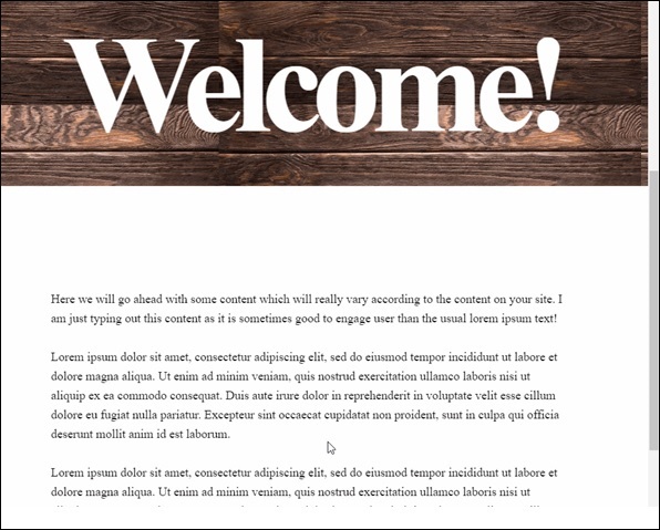
打开 html 文件时,视差效果将可见,如下所示 −
注意 −在本教程的其余部分,我们将假定读者能够按照上述方法提供的文件夹结构创建 HTML 和 CSS 文件。
多背景方法
在此方法中,当用户向下滚动页面时,我们将看到不同的图像。有一张带铅笔的图像,它以不同的颜色组合来说明这种效果。
观察以下 HTML 页面的代码,如下所示 −
<html>
   <head>
      <link rel = "stylesheet" href = "styles.css">
   </head>

   <body>
      <h1>Multiple Background Example</h1>
      <div class = "parallax">
         <div class = "bg__First">First</div>
         <div class = "bg__Second">Second</div>
         <div class = "bg__Third">Third</div>
         <div class = "bg__Fourth">Fourth</div>
      </div>
   </body>

</html>
与上一个示例类似,我们将使用存储在与此 HTML 文件相同位置的 styles.css。我们有三个不同的 div,分别命名为 First、Second、Third 和 Fourth。
视差滚动的 CSS 代码如下所示 −
body, html {
   height : 100%;
   font-family : sans-serif;
}

.parallax [class*="bg__"] {
   position : relative;
   height : 50vh;
   text-indent : -9999px;
   background-attachment : fixed;
   background-position   : top center;
   background-size       : cover;
}
.parallax [class*="bg__"]:nth-child( 2n) {
   box-shadow : inset 0 0 1em #111;
}
.parallax .bg__First, .bg__Fourth {
   height : 100vh;
}
.parallax .bg__First {
   background-image : url("parallax0.png");
}
.parallax .bg__Second {
   background-image : url("parallax1.png");
}
.parallax .bg__Third {
   background-image : url("parallax2.png");
}
.parallax .bg__Fourth {
   background-image : url("parallax1.png");
}
在这里,我们从第 7 行开始创建视差效果,这里的重要属性是 background-attachment:fixed。
使用此属性,第一张带有彩色铅笔的图像将始终保持在顶部。当您向下滚动时,第 28 行中描述的不同图像将开始显示。
因此,您将能够看到如下面的 gif 所示的视差效果。下图是我们考虑用于多背景的示例的屏幕截图。

纯 CSS 视差
让我们结合前两种方法的知识,创建一个高级纯 CSS 视差效果。
不同之处在于我们排列 image 元素和 z-transform 属性的方式。CSS 代码后将提供该属性的说明。
使用记事本中的常用方法,使用以下代码创建 HTML 文件。
<html>
<head>
<link rel = "stylesheet" href = "styles.css">
</head>
<body>
<div class = "wrapParallax">
<div class = "parallax_one">
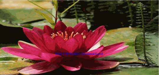
<img src = "https://cdn.pixabay.com/photo/2018/06/16/15/36/water-lily-3478924_640.jpg" alt = "">
</div>
<div class = "parallax_two">
<h1>Pure CSS Parllax Advanced Level</h1>
</div>
<div class = "parallax_three">
<img src = "https://cdn.pixabay.com/photo/2016/11/29/04/19/beach-1867285_640.jpg" alt = "">
</div>
</div>
</body>
</html>
对于 CSS 文件,代码如下 −
body, html {
   padding: 0;
   margin: 0;
}

h1 {
   color: blue;
   text-align: center;
   padding: 20px;
   text-shadow: 0px 0px 10px #fffff;
}

img {
   width:100vw;
   height:100vh;
}

.wrapParallax {
   perspective: 100px;
   height: 100vh;
   overflow-x: hidden;
   overflow-y: auto;
}

.parallax {
   position: absolute;
   top: 0;
   bottom: 0;
   right: 0;
   left: 0;
}

.parallax_one {
   transform: translateZ(-100px) scale(2)
}

.parallax_two {
   z-index: 10;
   transform: translateZ(-200px) scale(3)
}

.parallax_three {
   margin-top: 100vh;
}
代码分析
我们使用 position:absolute 属性在 第 26 行 中固定了第一层的位置。位置也硬编码为 0。
在 parallax_two(即带有标题的层)中,我们应用了 z-index: 10 来为标题提供浮动效果。通过提供 margin-top 属性,将层 parallax_three 移至底部。
因此,我们可以提高视差效果的复杂程度。
观察下图所示的效果。