Python Plotly – 如何在散点图中同时应用颜色/形状/大小?
plotlypythonserver side programmingprogramming
Plotly 是一个用于创建基于 Web 的交互式图表的开源 Python 库。在本教程中,我们将展示如何使用 Plotly 在散点图中应用颜色/形状/大小。
在这里,我们将使用 plotly.graph_objects 模块来生成图形。它包含很多生成图表的方法。
此外,我们将使用 add_trace() 方法创建散点图,然后使用 add_shape() 方法设置类型、形状和线条颜色。
最后,我们将使用 update_layout() 方法设置图表的高度和宽度。
按照下面给出的步骤在散点图中应用颜色/形状。
步骤 1
将 plotly.graphs_objs 模块和别名导入为 go。
import plotly.graphs_objs as go
步骤 2
使用add_trace() 方法生成散点图。
# 创建文本标签的散点轨迹
fig.add_trace(go.Scatter(
    x=[1.5, 3.5],
    y=[0.75, 2.5],
    text=["Circle", "Filled Circle"],
    mode="text",
))
步骤 3
使用 update_axes() 方法更新散点图的轨迹。
# 设置轴属性
fig.update_xaxes(range=[0, 4.5], zeroline=False)
fig.update_yaxes(range=[0, 4.5])
步骤4
使用 add_shape() 方法在图表上添加两个圆形。
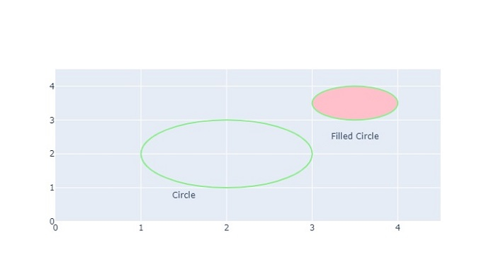
# 添加圆形
fig.add_shape(type="circle", xref="x", yref="y", x0=1, y0=1, x1=3, y1=3, line_color="LightGreen", )
fig.add_shape(type="circle", xref="x", yref="y", fillcolor="pink", x0=3, y0=3, x1=4, y1=4, line_color="LightGreen",)
步骤 5
使用 update_layout() 方法设置图表的高度和宽度 −
# 设置图形大小
fig.update_layout(width=800, height=800)
示例
应用颜色/形状/大小的完整代码如下 −
import plotly.graph_objects as go
fig = go.Figure()
# Create scatter trace of text labels
fig.add_trace(go.Scatter(
   x=[1.5, 3.5],
   y=[0.75, 2.5],
   text=["Circle", "Filled Circle"],
   mode="text",
))

# Set axes properties
fig.update_xaxes(range=[0, 4.5], zeroline=False)
fig.update_yaxes(range=[0, 4.5])

# Add circles
fig.add_shape(type="circle", xref="x", yref="y", x0=1, y0=1, x1=3, y1=3, line_color="LightGreen",)

fig.add_shape(type="circle", xref="x", yref="y",
fillcolor="pink", x0=3, y0=3, x1=4, y1=4, line_color="LightGreen", )

# Set figure size
fig.update_layout(width=716, height=400)
fig.show()
输出
执行后,它将在浏览器上显示以下输出 -
同样,您可以尝试创建不同类型的图形作为图像。