如何在 Python Plotly 中显示 3D 散点图中的图例和标签轴?
plotlypythonserver side programmingprogramming
Plotly 是一个用于创建图表的开源 Python 库。Python 用户可以使用 Plotly 创建交互式的基于 Web 的可视化效果,这些可视化效果可以在 Jupyter 笔记本中显示、保存到独立的 HTML 文件中,或使用 Dash 作为 Web 应用程序的一部分。
在本教程中,我们将展示如何使用 Plotly 在 3D 散点图中显示图例和标签轴。
在这里,我们将使用 plotly.express 来生成图形。它包含许多方法来自定义图表并将其呈现为 HTML 格式。
我们将使用 Pandas 模块来创建生成 DataFrame。
此外,我们将使用 plotly.graphs_obj() 方法生成具有不同图的图形。
按照下面给出的步骤显示图例和标签轴。
步骤 1
导入plotly.express模块并别名为px。
import plotly.express as px
步骤 2
使用 Pandas 创建数据框。
data = {
   'gadget' : ['mobile','tablet','ipad','laptop'],
   'rating' :[3,4,2,1],
   'price':[20000,50000,30000,90000]
}
df = pd.DataFrame(data)
步骤 3
使用 scatter_3d() 方法通过应用 X 和 y 坐标值创建散点 3D 图 −
# 创建 scatter_3d 图
fig = px.scatter_3d(
   df, x = 'gadget',
   y = 'rating',z = 'price',
   title="scatter 3D plot"
)
步骤 4
使用 update_layout() 方法更新布局,其属性如下 −
fig.update_layout(
    font_family="Courier New",
    font_color="blue",
    title_font_family="Times New Roman",
    title_font_color="red",
    legend_title_font_color="green"
)
示例
在 3D 散点图中显示图例和标签轴的完整代码如下 −
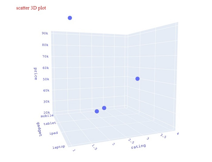
import plotly.express as px
import pandas as pd
# Create DataFrame
data = {
   'gadget' : ['mobile','tablet','ipad','laptop'],
   'rating' :[3,4,2,1],
   'price':[20000,50000,30000,90000]
}

df = pd.DataFrame(data)

# Create scatter_3d plot
fig = px.scatter_3d(df, x = 'gadget', y = 'rating',z = 'price', title="scatter 3D plot", width=716, height=750)

# Update the figure layout
fig.update_layout(
   font_family="Courier New",
   font_color="blue",
   title_font_family="Times New Roman",
   title_font_color="red",
   legend_title_font_color="green"
)
fig.show()
输出
执行后,它将在浏览器上显示以下输出 -