Polymer - Iron Collapse
<iron-collapse> 元素用于折叠内容。要显示或隐藏内容,请使用 open 或 toggle()。
可折叠元素的最大高度/最大宽度由 iron-collapse 元素自动调整。
用于样式设置的自定义属性和混合如下 −
--iron-collapse-transition-duration − 这是动画过渡的持续时间。默认值为 300ms。
示例
要实现 iron-collapse 元素,请在命令提示符中导航到您的项目文件夹并使用以下命令 −
bower install PolymerElements/iron-collapse --save
bower install PolymerElements/paper-toggle-button --save
上述命令将两个元素都安装在 bower_components 文件夹中。然后,您必须在 index.html 文件中导入这两个文件,如下所示 −
<link rel = "import" href = "iron-collapse/iron-collapse.html">
<link rel = "import" href = "paper-toggle-button/paper-toggle-button.html">
以下示例演示了 iron-collapse 元素的使用 −
<!DOCTYPE html>
<html>
   <head>
      <title>iron-collapse</title>
      <base href = "http://polygit.org/polymer+:master/components/">
      <link rel = "import" href = "polymer/polymer.html">
      <link rel = "import" href = "paper-toggle-button/paper-toggle-button.html">
      <link rel = "import" href = "iron-collapse/iron-collapse.html">

      <style>
         #coll {
            display: flex;
            width: 500px;
         }
         demo-collapse{
            border: 2px solid LightGrey;
            width: 50%;
         }
      </style>
   </head>

   <body>
      <h3>Iron Collapse Example</h3>
      <dom-module id = "demo-collapse">
         <template>
            <paper-toggle-button checked = "{{opened}}">Collapse this</paper-toggle-button>
            <iron-collapse opened = "[[opened]]">
               <div><p>This is polymerjs iron-collapse.</p></div>
            </iron-collapse>
         </template>
      </dom-module>

      <script>
         Polymer ({
            is: 'demo-collapse',
         });
      </script>

      <div id = "coll">
         <demo-collapse></demo-collapse>
      </div>
   </body>
</html>
输出
要运行应用程序,请导航到您的项目目录并使用以下命令运行 −
polymer serve
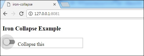
现在打开浏览器并导航到 http://127.0.0.1:8081/。以下是输出。
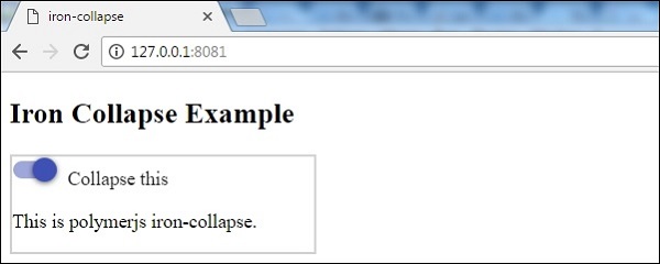
单击切换按钮时,以下是输出。
 polymer_elements.html

