Python 中的直方图绘制和拉伸
直方图绘制和拉伸是数据可视化和缩放的强大工具,它允许您表示数值变量的分布,并分布在直方图数据集的整个值范围内。此过程可用于改善图像的对比度或提高直方图中数据的可见性。
直方图是数据集频率分布的图形表示。它可以可视化一组连续数据的概率的底层分布。在本文中,我们将讨论如何使用内置函数以及不使用内置函数在 Python 中创建和拉伸直方图。
在 Python 中绘制和拉伸直方图(使用内置函数)
按照下面给出的步骤,使用 matplotlib 和 OpenCV 的内置函数绘制和拉伸直方图,它还显示 RGB 通道 -
首先使用 cv2.imread 函数加载输入图像
使用 cv2.split 函数将通道拆分为红色、绿色和蓝色
然后使用 matplotlib 库中的 plt.hist 函数绘制每个通道的直方图。
使用 cv2.equalizeHist 函数拉伸每个通道的对比度。
使用将通道重新合并在一起cv2.merge 函数。
使用 plt.imshow 函数和 matplotlib 库中的 subplots 函数并排显示原始图像和拉伸图像的侧面。
注意 - 拉伸图像的对比度会导致其整体外观发生变化,因此在评估结果时必须小心谨慎,以确保它们符合预期目标。
下面给出了 Python 中直方图绘制和拉伸的示例程序。在这个程序中,我们假设输入图像有 RGB 通道。如果图像具有不同的颜色空间,则可能需要额外的步骤来正确处理颜色通道。
示例
import cv2
import numpy as np
import matplotlib.pyplot as pltt
# 加载具有 RGB 通道的输入图像
img_sam = cv2.imread('sample.jpg', cv2.IMREAD_COLOR)
# 将通道分为红色、绿色和蓝色
rd, gn, bl = cv2.split(img_sam)
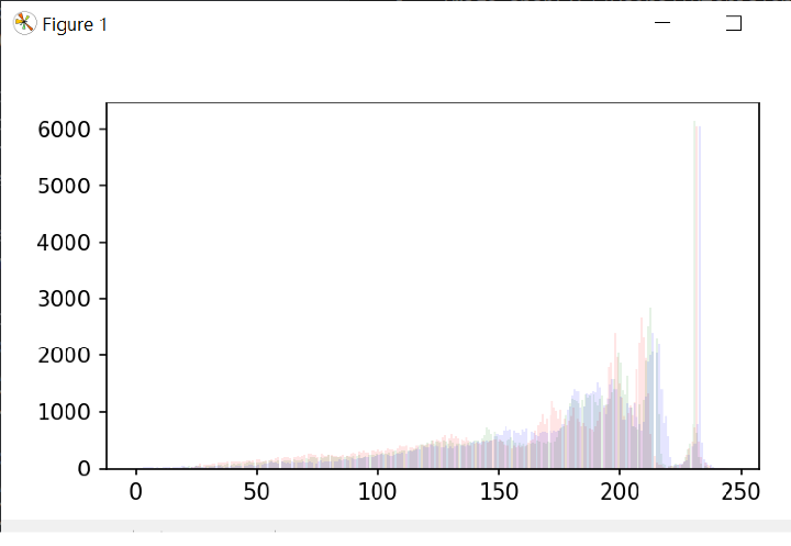
# 绘制每个通道的直方图
pltt.hist(rd.ravel(), bins=277, color='red', alpha=0.10)
pltt.hist(gn.ravel(), bins=277, color='green', alpha=0.10)
pltt.hist(bl.ravel(), bins=277, color='blue', alpha=0.10)
pltt.show()
# 拉伸每个通道的对比度
red_c_stretch = cv2.equalizeHist(rd)
green_c_stretch = cv2.equalizeHist(gn)
blue_c_stretch = cv2.equalizeHist(bl)
# 将通道重新合并在一起
img_stretch = cv2.merge((red_c_stretch, green_c_stretch, blue_c_stretch))
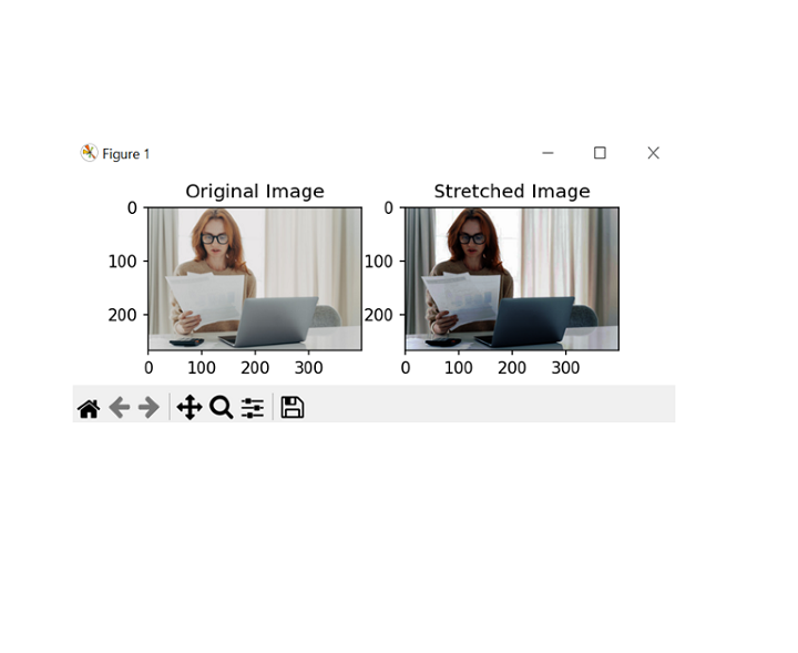
# 并排显示原始图像和拉伸图像
pltt.subplot(121)
pltt.imshow(cv2.cvtColor(img_sam, cv2.COLOR_BGR2RGB))
pltt.title('Original_Image')
pltt.subplot(122)
pltt.imshow(cv2.cvtColor(img_stretch, cv2.COLOR_BGR2RGB))
pltt.title('Stretched_Image')
pltt.show()
输出
在 Python 中绘制和拉伸直方图(不使用内置函数)
按照下面给出的步骤,在 Python 中使用 RGB 通道绘制和拉伸直方图,而无需使用内置函数。
使用 cv2.imread 函数加载输入图像。
使用数组切片将通道分为红色、绿色和蓝色。
使用嵌套循环和 np.zeros 函数计算每个通道的直方图,以用零初始化数组。
通过查找每个通道中的最小值和最大值并应用线性变换将像素值缩放到 0-255 的整个范围来拉伸每个通道的对比度。
对于上述步骤,使用嵌套循环和 np.uint8 数据类型来确保像素值保持在 0-255 的范围内。
使用 cv2.merge 函数将通道重新合并在一起。
使用 plt.imshow 函数和 matplotlib 库中的 subplots 函数并排显示原始图像和拉伸图像的侧面。
以下是执行相同操作的程序示例 -
注意 - 下面的程序假设输入图像具有 RGB 通道,并且像素值表示为 8 位整数。如果图像具有不同的颜色空间或数据类型,则可能需要其他步骤才能正确评估结果。
示例
import cv2
import numpy as np
import matplotlib.pyplot as pltt
# 加载输入图像
img = cv2.imread('sample2.jpg', cv2.IMREAD_COLOR)
# 将图像拆分为颜色通道
r, g, b = img[:,:,0], img[:,:,1], img[:,:,2]
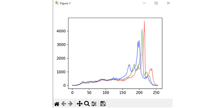
# 绘制每个通道的直方图
hist_r = np.zeros(256)
hist_g = np.zeros(256)
hist_b = np.zeros(256)
for i in range(img.shape[0]):
for j in range(img.shape[1]):
hist_r[r[i,j]] += 1
hist_g[g[i,j]] += 1
hist_b[b[i,j]] += 1
pltt.plot(hist_r, color='red', alpha=0.10)
pltt.plot(hist_g, color='green', alpha=0.10)
pltt.plot(hist_b, color='blue', alpha=0.10)
pltt.show()
# 拉伸每个通道的对比度
min_r, max_r = np.min(r), np.max(r)
min_g, max_g = np.min(g), np.max(g)
min_b, max_b = np.min(b), np.max(b)
re_stretch = np.zeros((img.shape[0], img.shape[1]), dtype=np.uint8)
gr_stretch = np.zeros((img.shape[0], img.shape[1]), dtype=np.uint8)
bl_stretch = np.zeros((img.shape[0], img.shape[1]), dtype=np.uint8)
for i in range(img.shape[0]):
for j in range(img.shape[1]):
re_stretch[i,j] = int((r[i,j] - min_r) * 255 / (max_r - min_r))
gr_stretch[i,j] = int((g[i,j] - min_g) * 255 / (max_g - min_g))
bl_stretch[i,j] = int((b[i,j] - min_b) * 255 / (max_b - min_b))
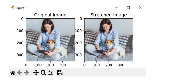
# 将通道重新合并在一起
img_stretch = cv2.merge((re_stretch, gr_stretch, bl_stretch))
# 并排显示原始图像和拉伸图像
pltt.subplot(121)
pltt.imshow(cv2.cvtColor(img, cv2.COLOR_BGR2RGB))
pltt.title('原始图像')
pltt.subplot(122)
pltt.imshow(cv2.cvtColor(img_stretch, cv2.COLOR_BGR2RGB))
pltt.title('拉伸图像')
pltt.show()
输出
结论
总之,Python 中的直方图绘制和拉伸是一种非常有用的提高数字图像对比度的方法。我们可以通过绘制直方图颜色通道来可视化像素值的分布并识别低对比度区域。我们了解到,我们甚至可以增加图像的动态范围,并通过使用线性变换拉伸对比度来显示可能隐藏的细节。