Matplotlib - 小提琴图
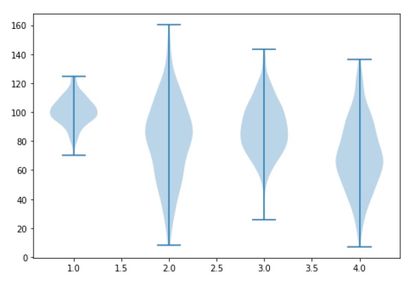
小提琴图类似于箱线图,不同之处在于它们还显示数据在不同值下的概率密度。 与标准箱形图中一样,这些图包括数据中位数的标记和指示四分位数间距的方框。叠加在这个箱线图上的是核密度估计。 与箱形图一样,小提琴图用于表示不同"类别"之间的变量分布(或样本分布)的比较。
小提琴图比普通箱线图提供的信息更多。 事实上,虽然箱形图仅显示汇总统计数据,例如均值/中位数和四分位数范围,但小提琴图显示了数据的完整分布。
import matplotlib.pyplot as plt
import numpy as np

np.random.seed(10)
collectn_1 = np.random.normal(100, 10, 200)
collectn_2 = np.random.normal(80, 30, 200)
collectn_3 = np.random.normal(90, 20, 200)
collectn_4 = np.random.normal(70, 25, 200)

## combine these different collections into a list
data_to_plot = [collectn_1, collectn_2, collectn_3, collectn_4]

# Create a figure instance
fig = plt.figure()

# Create an axes instance
ax = fig.add_axes([0,0,1,1])

# Create the boxplot
bp = ax.violinplot(data_to_plot)
plt.show()