如何在 R 中使用 ggplot2 在顶部显示图例?
r programmingserver side programmingprogramming更新于 2025/4/8 7:37:17
要在 R 中使用 ggplot2 在顶部显示图例,我们可以使用 theme 函数并将 legend.justification 参数传递给 top。
例如,如果我们有一个名为 df 的数据框,其中包含三列,即 X、Y 和 F,其中 X 和 Y 是数字,F 是分类,那么我们可以在 X 和 Y 之间创建散点图,并使用下面给出的命令 − 在 F 中的值上色点。
ggplot(df,aes(X,Y))+geom_point(aes(colour=factor(F)))+theme(legend.justification="top")
示例
以下代码片段创建了一个示例数据框 −
x<-rnorm(20)
y<-rnorm(20)
Grp<-sample(LETTERS[1:3],20,replace=TRUE)
df<-data.frame(x,y,Grp)
df
创建以下数据框
           x             y  Grp
 1 -1.066129589  0.828709138 C
 2 -1.222825364 -0.306424935 C
 3  0.429354500 -1.446665340 B
 4 -0.609955977 -0.288351976 A
 5  1.200129675  0.716336213 C
 6  0.800850596 -1.095220235 C
 7  0.517368694  1.561305370 C
 8 -0.006456066 -0.002988512 B
 9  0.555280469 -1.241763197 C
10 -2.043538292 -1.734706075 C
11 -1.151771052 -0.878394321 B
12  0.845068460 -1.139618835 C
13  2.071684310  0.825474682 B
14 -0.250229200 -0.120597321 B
15 -1.280790787 -0.461785183 A
16 -0.028062183 -0.154095381 B
17 -0.620917924  0.398107075 A
18  0.302128850  0.497374731 C
19  0.719935519 -1.230463223 A
20 -0.862276767  0.518153886 A
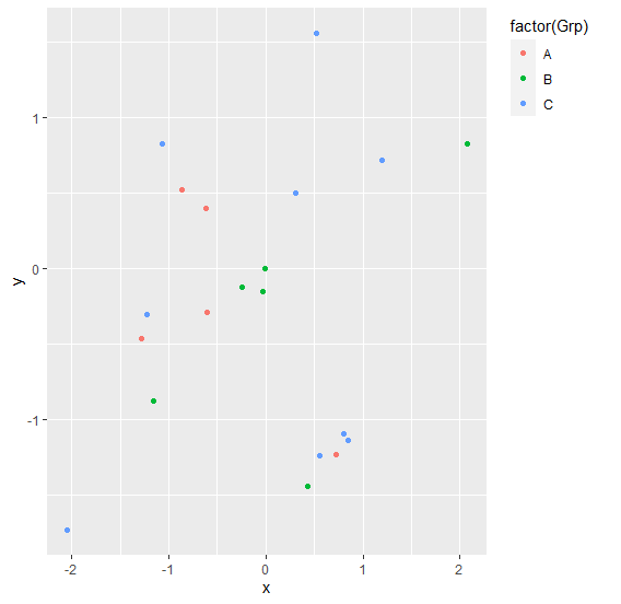
要加载 ggplot2 包并根据上面创建的数据框上的 Grp 值在 x 和 y 之间创建散点图,请将以下代码添加到上面的代码片段中 −
x<-rnorm(20)
y<-rnorm(20)
Grp<-sample(LETTERS[1:3],20,replace=TRUE)
df<-data.frame(x,y,Grp)
library(ggplot2)
ggplot(df,aes(x,y))+geom_point(aes(colour=factor(Grp)))
输出
如果将上述所有代码片段作为单个程序执行,则会生成以下输出 −
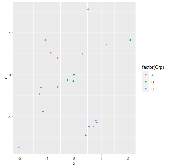
要在上面创建的数据框上基于 Grp 值创建 x 和 y 之间的散点图,并在其顶部添加图例,请将以下代码添加到上面的代码片段中 −
x<-rnorm(20)
y<-rnorm(20)
Grp<-sample(LETTERS[1:3],20,replace=TRUE)
df<-data.frame(x,y,Grp)
library(ggplot2)
ggplot(df,aes(x,y))+geom_point(aes(colour=factor(Grp)))+theme(legend.justification="top")
输出
如果将上述所有代码片段作为单个程序执行,则会生成以下输出 −