如何在 R 中使用 ggplot2 创建的图表上更改 Y 轴的网格线?
r programmingserver side programmingprogramming更新于 2025/4/16 0:52:17
通常,使用 ggplot2 包创建的绘图上的网格线彼此相距较远,但有时如果网格线彼此靠近,绘图看起来会更好,因此,我们可能需要这样做。如果 Y 轴绘制连续变量,可以通过设置 minor_breaks 并使用 scale_y_continuous 进行中断来实现。
示例
考虑下面的数据框 −
> x<-sample(1:100,20)
> y<-sample(1:50,20)
> df<-data.frame(x,y)
> df
输出
   x  y
1 14 16
2 36 1
3 78 18
4 61 6
5 19 11
6 2 40
7 93 23
8 10 13
9 3 21
10 55 31
11 75 28
12 51 33
13 13 12
14 80 37
15 98 49
16 66 39
17 79 10
18 52 38
19 74 47
20 12 9
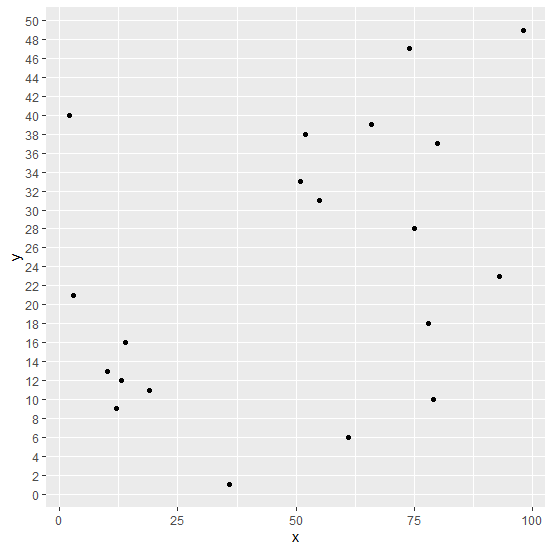
加载 ggplot2 包并在 x 和 y 之间创建散点图 −
> library(ggplot2)
> ggplot(df,aes(x,y))+geom_point()
输出
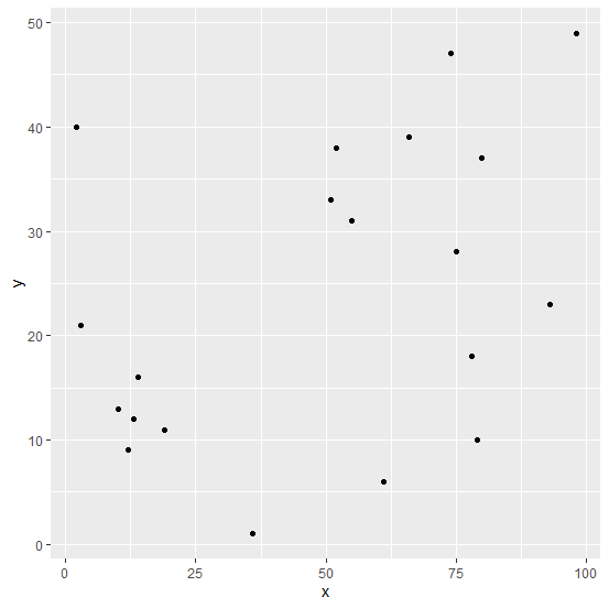
更改图中的网格线 −
> ggplot(df,aes(x,y))+geom_point()+scale_y_continuous(minor_breaks=seq(0,50,2),breaks
=seq(0,50,2))
输出