如何使用 ggplot2 更改绘图标题的调整,使其在 R 中的 Y 轴标签上方对齐?
r programmingserver side programmingprogramming更新于 2025/4/15 16:52:17
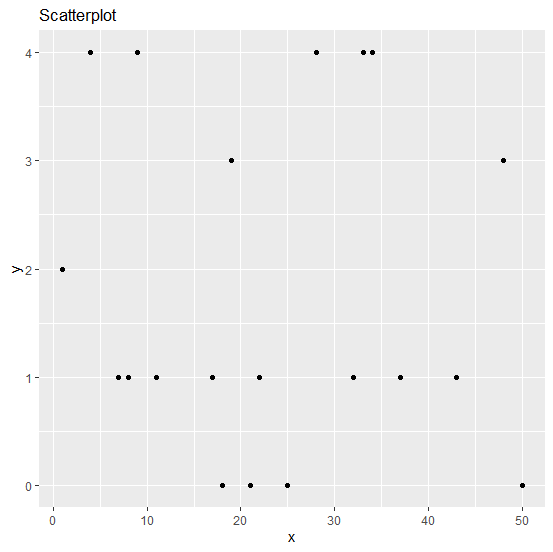
当我们创建一个绘图并在其上方放置标题时,标题的对齐方式默认为左对齐,位于绘图区域的边缘。但有时,我们想将标题显示在 Y 轴标签的上方,因此,我们可以使用主题函数并相应地设置 hjust 参数。
示例
考虑下面的数据框 −
x<-sample(1:50,20)
y<-rpois(20,2)
df<-data.frame(x,y)
df
输出
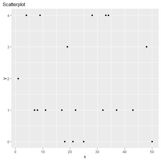
   x  y
1  1  2
2  50 0
3  19 3
4  33 4
5  43 1
6  17 1
7  7  1
8  28 4
9  18 0
10 22 1
11 21 0
12 11 1
13 34 4
14  9 4
15  4 4
16 37 1
17 48 3
18 25 0
19  8 1
20 32 1
示例
library(ggplot2)
ggplot(df,aes(x,y))+geom_point()+labs(title="Scatterplot")
输出
示例
ggplot(df,aes(x,y))+geom_point()+labs(title="Scatterplot")+theme(plot.title=element_tex
t(hjust=-0.07))
输出