如何在 R 中使用 ggplot2 更改方面标题的颜色?
r programmingserver side programmingprogramming更新于 2025/4/8 2:37:17
要使用 R 中的 ggplot2 更改方面标题的颜色,我们可以使用带有 strip.text.x 的主题函数。参数。
例如,如果我们有一个名为 df 的数据框,其中包含三列,即 X、Y 和 F,其中 F 是因子列,那么我们可以为 F 中的值创建 X 和 Y 之间的分面散点图,使用下面提到的命令,使用不同颜色的分面标题 −
ggplot(df,aes(X,Y))+geom_point()+facet_wrap(~F)+theme(strip.text.x=element_text(colour="red"))
示例
以下代码片段创建了一个示例数据框 −
Price<-sample(1:10,20,replace=TRUE)
Demand<-sample(50:100,20)
Region<-sample(c("Plane","Hill"),20,replace=TRUE)
df<-data.frame(Price,Demand,Region)
df
创建以下数据框
  Price Demand Region
 1 3    62     Plane
 2 4    78     Plane
 3 5    75     Hill
 4 10   64     Hill
 5 2    54     Plane
 6 1    58     Plane
 7 3    81     Plane
 8 6    91     Plane
 9 4    50     Plane
10 5    76     Plane
11 1    63     Hill
12 9    72     Hill
13 9    93     Plane
14 3    88     Plane
15 10   84     Hill
16 1    89     Plane
17 2    82     Plane
18 6    55     Plane
19 7    98     Hill
20 4    67     Hill
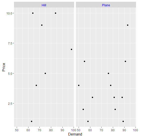
要加载 ggplot2 包并在上面创建的数据框中基于区域创建需求和价格之间的散点图,请将以下代码添加到上面的代码片段中 −
Price<-sample(1:10,20,replace=TRUE)
Demand<-sample(50:100,20)
Region<-sample(c("Plane","Hill"),20,replace=TRUE)
df<-data.frame(Price,Demand,Region)
library(ggplot2)
ggplot(df,aes(Demand,Price))+geom_point()+facet_wrap(~Region)
输出
如果将上述所有代码片段作为单个程序执行,则会生成以下输出 −
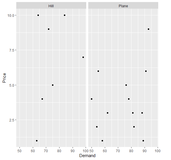
要在上面创建的数据框中基于区域创建需求和价格之间的散点图(以蓝色表示),请将以下代码添加到上面的代码片段中 −
Price<-sample(1:10,20,replace=TRUE)
Demand<-sample(50:100,20)
Region<-sample(c("Plane","Hill"),20,replace=TRUE)
df<-data.frame(Price,Demand,Region)
library(ggplot2)
ggplot(df,aes(Demand,Price))+geom_point()+facet_wrap(~Region)+theme(strip.text.x=element_text(colour="blue"))
输出
如果将上述所有代码片段作为一个程序执行,则会生成以下输出 −