如何使用 Tensorflow 可视化模型结果?
在应用增强和 dropout 方法(以避免过度拟合)后,可以使用 ‘matplotlib’ 库可视化花卉数据集。这是使用 ‘plot’ 完成的方法。
阅读更多: 什么是 TensorFlow,以及 Keras 如何与 TensorFlow 配合使用来创建神经网络?
我们将使用 Keras Sequential API,它有助于构建用于处理普通层堆栈的顺序模型,其中每个层都有一个输入张量和一个输出张量。
包含至少一个层的神经网络称为卷积层。我们可以使用卷积神经网络构建学习模型。
使用 keras.Sequential 模型创建图像分类器,并使用 preprocessing.image_dataset_from_directory 加载数据。数据有效地从磁盘加载。识别过度拟合并应用技术来缓解它。这些技术包括数据增强和 dropout。有 3700 朵花的图像。该数据集包含 5 个子目录,每个类有一个子目录。它们分别是:
雏菊、蒲公英、玫瑰、向日葵和郁金香。
我们使用 Google Colaboratory 来运行以下代码。Google Colab 或 Colaboratory 有助于在浏览器上运行 Python 代码,并且无需配置,可以免费访问 GPU(图形处理单元)。Colaboratory 建立在 Jupyter Notebook 之上。
当训练示例数量较少时,模型会从训练示例中的噪声或不需要的细节中学习。这会对模型在新示例上的性能产生负面影响。
当将 dropout 应用于某个层时,它会在训练过程中随机从该层中删除一些输出单元。这是通过将激活函数设置为 0 来实现的。Dropout 技术将小数作为输入值(如 0.1、0.2、0.4 等)。这个数字 0.1 或 0.2 基本上表示 10% 或 20% 的输出单元是随机来自应用层。
数据增强通过借助随机变换对现有示例进行增强,从现有示例中生成额外的训练数据,从而产生看起来可信的图像。以下是一个例子:
示例
print("Visualizing the data after performing data augmentation and dropout")
print("Accuracy is being calculated")
acc = history.history['accuracy']
print("Loss is being calculated")
val_acc = history.history['val_accuracy']
loss = history.history['loss']
val_loss = history.history['val_loss']
epochs_range = range(epochs)
print("The results are being visualized")
plt.figure(figsize=(8, 8))
plt.subplot(1, 2, 1)
plt.plot(epochs_range, acc, label='Training Accuracy')
plt.plot(epochs_range, val_acc, label='Validation Accuracy')
plt.legend(loc='lower right')
plt.title('Training and Validation Accuracy')
plt.subplot(1, 2, 2)
plt.plot(epochs_range, loss, label='Training Loss')
plt.plot(epochs_range, val_loss, label='Validation Loss')
plt.legend(loc='upper right')
plt.title('Training and Validation Loss')
plt.show()
代码来源 −https://www.tensorflow.org/tutorials/images/classification
输出
Visualizing the data after performing data augmentation and dropout
Accuracy is being calculated
Loss is being calculated
The results are being visualized
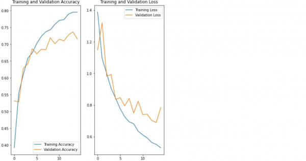
解释
- 使用‘matplotlib’库对数据进行可视化。
- 计算与训练模型相关的准确率和损失。
- 训练准确率和验证准确率显示在控制台上。